2026 color trends
2026 color trends
Use this page when a reader wants trend context plus practical palette choices for brand, room, wedding, or content work.
2026 color trend article
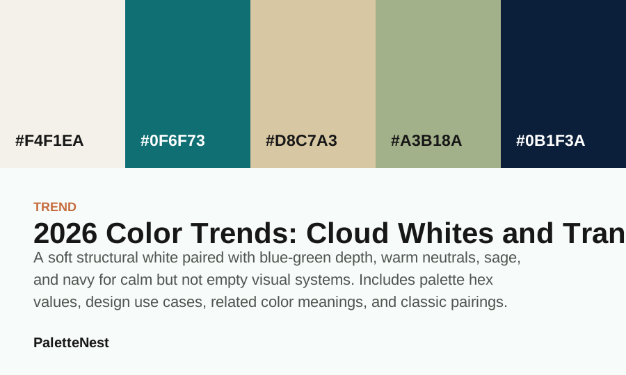
A soft structural white paired with blue-green depth, warm neutrals, sage, and navy for calm but not empty visual systems.
search intent map
2026 color trends
Use this page when a reader wants trend context plus practical palette choices for brand, room, wedding, or content work.
reader guide
Translate public 2026 color trend signals into independent palettes for brands, rooms, weddings, content layouts, and tool workflows without claiming proprietary formulas.
search intent
differentiation
Boundary: Do not use this page when the reader only wants one exact sage green palette. Send them to the sage green palette article.
usefulness proof
reader checks
next decisions
source signal
Pantone names Cloud Dancer as its 2026 Color of the Year, while WGSN and Coloro point to Transformative Teal as a 2026 signal. PaletteNest treats these as trend signals, not exact licensed color formulas.
why it matters
The useful 2026 story is not only a single shade. It is the contrast between quiet white space and resilient blue-green color: one gives layouts breathing room, the other gives them identity.
how to use it
Use the cloud white as the dominant field, bring Transformative Teal into navigation, packaging bands, or hero accents, then soften the palette with sage and warm neutral surfaces.
Pair it with sage green for wellness content, navy for authority, or clay neutrals when the design needs a warmer editorial tone.
related colors
related palettes
classic pairings
Short answer
short answer
A soft structural white paired with blue-green depth, warm neutrals, sage, and navy for calm but not empty visual systems. A trend article is most useful when it turns a headline color into practical decisions: what to use as the field, what to use as an accent, which colors make the palette more commercial, and which combinations make it more editorial or emotional.
The useful 2026 story is not only a single shade. It is the contrast between quiet white space and resilient blue-green color: one gives layouts breathing room, the other gives them identity. This is why the page treats the trend as a palette system rather than a single isolated swatch. A single color can start the story, but the surrounding colors determine whether the result feels calm, premium, playful, seasonal, or brand-ready.
contents
color values
| Color | Hex | Role | Use note |
|---|---|---|---|
| Field | #F4F1EA | Anchor | Use for the main mood or the first repeated brand signal. |
| Signal | #0F6F73 | Surface | Use for large quiet areas, reading backgrounds, or room surfaces. |
| Beige | #D8C7A3 | Support | Use to connect the anchor and the accent without flattening the palette. |
| Sage Green | #A3B18A | Depth | Use for headings, structure, shadows, trim, or formal contrast. |
| Navy Blue | #0B1F3A | Accent | Use in small repeated moments so the palette has energy without noise. |
application
Use the cloud white as the dominant field, bring Transformative Teal into navigation, packaging bands, or hero accents, then soften the palette with sage and warm neutral surfaces. The practical move is to choose a role before choosing a color. If the trend color becomes a background, it needs a text-safe companion. If it becomes an accent, it needs enough quiet space around it. If it becomes a brand color, it needs a neutral system that can repeat across pages.
Pair it with sage green for wellness content, navy for authority, or clay neutrals when the design needs a warmer editorial tone. For content sites, use the trend as a section signal, article illustration palette, download card, or seasonal feature band. Avoid turning every card, button, and paragraph into the trend color at the same time.
compare
mistakes
The first mistake is treating a trend as a command instead of a signal. A yearly color direction should help a designer ask better questions about surfaces, accents, contrast, materials, and audience fit. It should not replace the work of testing the palette in the actual page, room, package, or brand system.
The second mistake is copying only the headline color and ignoring the support system. A trend becomes useful when it has a quiet field, a readable depth value, one or two supporting colors, and a documented accent role. Without those pieces, the page becomes a mood board instead of a practical reference.
2026 context
The useful reading of 2026 is that quiet colors are being asked to do more work. A soft white field is no longer just empty space, and a blue-green signal color is no longer only a decorative accent. Together they create a practical system: calm surfaces for reading, enough color identity for memory, and enough depth for brands that cannot afford to feel generic.
This matters for content sites because search-driven readers arrive with intent, not patience. They need a page to feel organized before they trust the palette. Cloud-like whites help headings, tables, screenshots, and swatches breathe. Teal or blue-green accents give the page a memorable thread without forcing every module into a saturated color block.
The same logic applies to interiors, packaging, newsletters, wedding boards, and small brand systems. The trend is not a demand to repaint everything white and teal. It is a reminder that a durable color system can be built from quiet base surfaces, one resilient identity color, and a few warm or deep companions that keep the palette human.
field color
A cloud white or warm off-white works best when it has a role. Use it for reading surfaces, large interior walls, packaging backgrounds, stationery paper, dashboard panels, or editorial space around images. The point is not to make the design blank. The point is to lower friction so the other colors can signal hierarchy, warmth, and emphasis more clearly.
The practical risk is that white can feel unfinished when no secondary structure exists. Add fine borders, quiet tan surfaces, off-black text, or a deeper blue-green mark so the field has edges. Without those edges, a cloud white system can look like a wireframe. With them, it becomes a flexible base that can hold both dense content and calm visual rhythm.
When testing a cloud white field, place the actual longest headline, the longest FAQ answer, and the smallest label into the layout. If the page still reads without relying on decoration, the field is doing its job. If everything feels like it is floating, add a warmer neutral or a deeper structural color before adding more accent colors.
signal color
The blue-green part of the 2026 story is valuable because it can feel calm and active at the same time. It has enough blue to suggest clarity and enough green to suggest restoration, growth, and environmental awareness. That makes it useful for wellness brands, education products, climate storytelling, travel content, SaaS dashboards, and editorial systems that need trust without corporate coldness.
Use the teal as a signal color before using it as a background. It works well in navigation states, section labels, download cards, packaging bands, charts, icons, and small hero details. When the surface area becomes too large, the color can start to dominate the entire mood, which makes the quiet field color less useful.
A good first test is to use the teal in only three places on a page: one high-level section marker, one interaction state, and one visual asset. If those three moments are enough to make the page recognizable, the color is strong enough. If the page still feels generic, deepen the teal slightly or pair it with navy before increasing saturation.
warmth
Cloud white and teal can become too cool if they are paired only with gray, black, and bright white. Warm neutrals solve that problem. Sand, parchment, soft beige, oat, clay, and muted tan add material memory. They make the palette feel touchable, which is important for interiors, food packaging, wellness content, wedding stationery, and lifestyle brands.
Use warm neutrals in the middle layer of the system. They can appear behind quotes, comparison tables, product callouts, sidebars, room textiles, menu blocks, or invitation details. They should not compete with the identity color. Their job is to make the white field feel chosen and to make the blue-green signal feel less isolated.
The mistake to avoid is treating warm neutral as a universal background. Too much beige can make the page feel old or low contrast. Keep the largest reading surface light, use warm neutral for contained sections, and reserve the deepest value for text or trim. The palette stays current when the warmth supports structure instead of replacing it.
sage bridge
Sage green fits the 2026 direction because it softens the gap between off-white surfaces and teal depth. It is quieter than the signal color, more colorful than a neutral, and easier to repeat in interiors or wellness content. In a palette, sage can act as the secondary support color that keeps the system organic without making it rustic.
Use sage in secondary panels, background washes, textile suggestions, small illustrations, category labels, or room-planning examples. It works especially well when the palette needs to move from digital clarity into a more lived-in tone. A color trend becomes more usable when it can travel across screen, paper, fabric, paint, and product photography.
The pairing risk is flatness. Sage, beige, and off-white can become too soft if no depth color appears. Add navy, charcoal, espresso, or a deeper teal to define edges. In a content site, this means headings, dividers, or small navigation elements should carry a stronger value so the article does not dissolve into gentle color.
depth
Navy is useful in the 2026 palette because it gives a quiet trend a serious backbone. A page with only cloud white, teal, sage, and tan can feel gentle but not decisive. Navy can handle headings, menus, chart lines, footer areas, and formal packaging details. It gives the system enough weight to work for professional content.
For Google-oriented pages, navy also helps scanning. Search visitors compare results quickly, and when they land on an article they need hierarchy immediately. A deep blue text color or structural accent can make the intro, table of contents, value table, and FAQ feel more trustworthy because the page has a clear typographic anchor.
Use navy carefully with teal. If both colors appear at equal strength, the palette can feel heavy. Let navy handle structure and let teal handle identity. Let cloud white or warm neutral separate them. That role separation is what makes the palette feel designed rather than simply assembled from colors that look good together.
content systems
For a color content site, the 2026 palette should organize information before it decorates the page. Use the lightest field for article reading, navy for headings, teal for persistent article identity, sage for related-link blocks, and warm neutral for tables or examples. This gives every color a repeatable job across hundreds of pages.
The homepage can show yearly trend blocks as colored editorial panels, while individual articles should behave more like reference pages. The article needs a short answer, table of contents, color values, examples, mistakes, FAQ, related links, and source notes. The palette should make those sections easier to scan, not hide them behind visual effects.
Search packaging should follow the same discipline. A title like 2026 Color Trends: Cloud Whites, Transformative Teal and Palette Ideas tells the reader what they will get. The intro should answer the query quickly. The rest of the article should prove depth through specific examples instead of repeating the same trend language.
brand use
A small brand can use the 2026 direction without becoming a trend clone. Start with the off-white as the main surface, choose teal or blue-green as the recognition color, add navy for serious text, and use sage or warm neutral to soften repeated modules. This gives the brand a palette that can survive beyond one season.
The important decision is proportion. A wellness brand might use more sage and warm neutral. A software product might use more navy and white. A travel or climate publication might let teal appear more frequently. The same five colors can support different meanings when the surface area and hierarchy change.
Before using it, test the palette in the brand's most ordinary assets: invoice, footer, navigation, error message, small label, and long article page. If the palette only works in the hero, it is not a system yet. A useful trend palette should still feel coherent in routine screens where there is no dramatic photography.
interiors
In rooms, the cloud white and teal story depends on material. Wall paint, window light, fabric weave, tile glaze, wood undertone, and metal finish all change the palette. A hex value can describe a direction, but it cannot replace sampling. Use the palette as a planning map, then test large samples in the actual light.
A practical room formula is cloud white walls, warm neutral textiles, sage or muted green secondary objects, navy or deep teal trim, and one small warm accent through clay, brass, or wood. The result feels calm but not empty because the palette has softness, depth, and material warmth.
The common mistake is making every object pale. A room needs depth the same way an article page needs headings. Without a dark value, the space can look washed out. Add a navy frame, deeper teal chair, dark wood piece, or charcoal line before adding more pastel colors.
packaging
For packaging, cloud white can create a clean label field, teal can identify the product family, sage can signal natural or calm positioning, and navy can carry legal or ingredient information. Warm neutral can make the packaging feel less sterile. The palette works when the shopper can understand the hierarchy quickly.
Use the strongest color for recognition and the quietest color for information. A saturated teal label with small white text may look attractive on a mockup but fail on a shelf or phone camera. In most cases, white or warm neutral should hold the text, while teal becomes a band, mark, icon field, or product-line signal.
If multiple products share the same system, vary the secondary accent rather than changing the whole palette. Keep the cloud field, navy text, and teal identity stable. Let sage, tan, clay, or blue change by product type. This preserves recognition while giving each item a usable distinction.
mistakes
The first mistake is copying a headline color without building a palette around it. A trend color alone does not answer text contrast, background rhythm, section hierarchy, or related-link design. Build the system around roles: field, signal, support, depth, accent, and neutral bridge.
The second mistake is turning calm into emptiness. White space is useful only when content has structure. Add tables, lists, examples, links, and source notes so the page feels like a reference, not a mood board. A color trend article should help a reader make decisions after the visual impression fades.
The third mistake is making the exact formula the point. Public trend systems can inspire direction, but production color choices should be your own. Use accessible values, test brand fit, document source notes, and avoid implying licensed precision when the article is translating a public signal into practical guidance.
accessibility
The 2026 palette has several gentle values, so contrast has to be tested early. Body copy should not sit on sage, tan, or teal unless the exact foreground and background values pass readability. For long articles, a quiet white or warm off-white surface with a deep navy or near-black text color is usually safer.
Accent colors should not carry critical information alone. If teal marks a selected state, add a label, underline, border, icon, or shape change. If sage marks a related article, include clear text. Search visitors scan quickly, and accessibility-friendly structure usually improves comprehension for everyone.
Use the same testing discipline in print and interiors. A color that passes on a bright screen may look dull on matte paper or dark in evening room light. The palette should be tested in the medium where it will live, not only in a clean design file.
seasonal use
A trend palette becomes disposable when every asset depends on the exact seasonal story. To make it last, separate the permanent system from seasonal emphasis. Keep cloud white, navy, and a neutral bridge as the stable structure. Let teal, sage, or a warmer accent become the seasonal layer that can be adjusted later.
For content calendars, use the palette in feature bands, download cards, trend roundups, and article graphics while leaving core navigation and body text stable. That makes the site feel current without forcing a redesign when the next color story arrives. The system absorbs trend energy instead of being consumed by it.
For brands, document which colors are core and which colors are campaign colors. A small note in a style guide can prevent future confusion: cloud white is the field, navy is the text depth, teal is the 2026 signal, sage is the soft support, and warm neutral is the human bridge.
search intent
A reader searching for 2026 color trends usually wants a quick answer first: what colors matter, why they matter, and how to use them. That answer should appear near the top of the page before the article becomes expansive. The trend palette is easier to trust when the opening makes the field color, signal color, neutral bridge, soft support, and depth color obvious.
After that short answer, the article can move into examples. Search visitors need specific situations: a website, a room, a package, a wedding board, a brand system, a chart, or a content hub. Each example shows how the same palette changes when surface area and hierarchy change. That is more useful than repeating that the colors are calm, modern, or sophisticated.
This is also why the article needs visible tables and internal links. A search page is not only an essay. It is a decision surface. A reader should be able to copy values, jump to related sage green or navy blue pages, compare a sage green palette, and open complementary color guidance without starting over.
internal links
The 2026 article should link outward into color meanings, palettes, combinations, and theory pages because color intent changes as the reader gets more specific. A trend page can introduce cloud white and teal, but a sage green meaning page can explain cultural boundaries, a sage green palette page can assign roles, and a combination page can compare actual companions.
Internal links should be contextual rather than dumped into a footer. Link to sage green when discussing soft organic support. Link to navy blue when discussing authority and readability. Link to colors that go with sage green when the reader needs pairing options. Link to complementary colors when the article explains why a contrast can become harsh.
This structure helps readers and search engines understand that the site is a color reference system, not a set of isolated swatch pages. The trend article becomes a hub into mature color meanings, palettes, combinations, and tools, while experimental result states stay separate from public articles until they are complete.
execution checklist
Start with the job of the page or object. If the goal is reading, make cloud white or warm off-white the field and navy the text depth. If the goal is recognition, let teal appear in repeated markers. If the goal is calm, let sage and warm neutral soften the system. If the goal is formality, give navy more structural weight.
Then test proportion. A useful first draft is 60 percent field, 20 percent neutral support, 10 percent depth, 7 percent soft support, and 3 percent signal accent. The numbers do not need to be exact, but they force the palette to have hierarchy. If every color gets 20 percent, the design usually feels busy or indecisive.
Finally, test the hardest surfaces: small mobile labels, long paragraphs, product photos, dim room light, print samples, and screenshot crops. A trend palette is ready only when it survives those routine conditions. If it works only in a large hero image, the color direction is still mood, not a production system.
limits
The 2026 palette is not ideal for every project. A children-focused brand may need more immediate playfulness. A nightlife or sports identity may need stronger contrast and faster energy. A luxury fashion direction may prefer black, deep wine, metallic warmth, or sharper monochrome restraint. Trends should be evaluated against audience and category, not adopted automatically.
The palette can also underperform when the product itself is already very pale, very blue-green, or very minimal. In that case, more cloud white may make the brand disappear. A stronger accent, warmer photography, deeper typography, or a more unexpected companion color may be necessary to create recognition.
The best use of a trend article is judgment. If the palette supports the content, use it with clear roles. If it weakens recognition or readability, borrow only one idea: quieter surfaces, resilient blue-green accents, warmer neutrals, sage support, or navy depth. A good trend gives options, not obligations.
practical summary
The strongest version of the 2026 color story is not a single swatch. It is a role-based palette that balances quiet, identity, warmth, nature, and depth. Cloud white gives space, teal gives memory, warm neutral gives material, sage gives softness, and navy gives authority.
When a design feels wrong, diagnose the role before replacing the color. If the palette feels empty, add structure. If it feels cold, add warmth. If it feels flat, add depth. If it feels noisy, reduce accent area. This keeps the original direction intact while solving the practical problem.
That is the reason this page treats trend references as starting points rather than final formulas. Good color work is not just naming a fashionable color. It is turning a signal into repeatable decisions that help readers, shoppers, guests, or users understand what matters first.
faq
sources
Trend references are used as public editorial signals. PaletteNest does not claim licensed Pantone, WGSN, Coloro, or paint-brand formulas; the palettes here are practical companion systems built from independent hex values.
Pantone names Cloud Dancer as its 2026 Color of the Year, while WGSN and Coloro point to Transformative Teal as a 2026 signal. PaletteNest treats these as trend signals, not exact licensed color formulas. PaletteNest uses public trend signals as editorial starting points and then builds practical companion palettes for designers, content teams, wedding planning, interiors, and small brand systems. The goal is usable color guidance, not a claim that every project must follow a single annual color.
Last updated by PaletteNest Editorial Desk on 2026-06-19.