complementary colors
Complementary colors
Use this page when the reader needs contrast logic before choosing exact colors.
guide
Complementary colors are opposite on the color wheel; compare pairs, softened sets, and 3 complementary colors for usable palettes.
search intent map
complementary colors
Use this page when the reader needs contrast logic before choosing exact colors.
reader guide
Learn how complementary colors work in practical design, when to soften exact opposites, and how to move from theory into pairings, palettes, contrast checks, and related articles.
search intent
differentiation
Boundary: Do not use this page as a replacement for a specific pairing article when the reader already knows the base color.
usefulness proof
reader checks
next decisions
composition
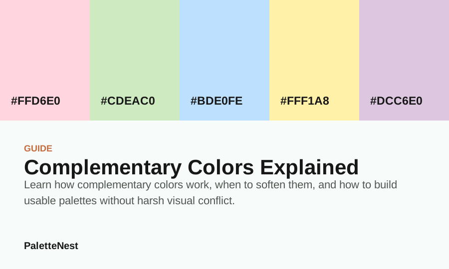
Pastel Color Palette supports complementary colors: definition, pairs and 3-color sets with soft playful roles for spring campaigns, gifts, social graphics; use #FFD6E0 as the lead value, then test proportion, contrast, materials, and next links in the full article.
Visuals on this page are original color boards built from the listed values. External photos appear only when a clear source and commercial-use permission are available.
Short answer
short answer
A complementary color is the hue opposite another hue on a color wheel. Blue and orange, red and green, and yellow and purple are the common starting pairs. In practical design, the pair usually needs role control: one color leads, the opposite color accents, and a neutral or softened middle value keeps the composition readable.
Searchers asking for complementary colors, complementary colour sets, or 3 complementary colors usually need examples they can use. Start with a pair, soften one or both sides, then add a third color only when it has a job: surface, bridge, text depth, or small accent.
contents
color values
| Color | Hex | Role | Use note |
|---|---|---|---|
| Blush Pink | #FFD6E0 | Anchor | Use for the main mood or the first repeated brand signal. |
| Mint Green | #CDEAC0 | Surface | Use for large quiet areas, reading backgrounds, or room surfaces. |
| Sky Blue | #BDE0FE | Support | Use to connect the anchor and the accent without flattening the palette. |
| Butter Yellow | #FFF1A8 | Depth | Use for headings, structure, shadows, trim, or formal contrast. |
| Lavender | #DCC6E0 | Accent | Use in small repeated moments so the palette has energy without noise. |
examples table
| Color wheel pair | Exact complement | Usable set | Best use |
|---|---|---|---|
| blue + orange | Blue sits opposite orange on a common color wheel. | navy + terracotta + warm white | Brand accents, packaging labels, editorial graphics, and room details that need clear energy. |
| red + green | Red and green are a classic complementary color pair. | burgundy + sage green + cream | Weddings, seasonal packaging, restaurant accents, and natural product boards. |
| yellow + purple | Yellow sits opposite purple or violet in many teaching wheels. | pale gold + lavender + charcoal | Beauty, spring events, social graphics, and premium details where full yellow would be too sharp. |
| teal + coral | Blue-green and red-orange create a practical near-complement. | deep teal + coral + ivory | Web sections, travel graphics, product cards, and energetic but readable callouts. |
three-color sets
| 3-color set | Roles | Where it works |
|---|---|---|
| red-violet + yellow-green + neutral cream | red-violet leads, yellow-green accents, cream gives the eye a reading surface. | Wedding stationery, beauty content, soft packaging, and illustrated article panels. |
| navy + clay orange + warm white | navy anchors text and structure, clay orange adds contrast, warm white protects readability. | Web pages, editorial graphics, menus, labels, and room palettes with dark trim. |
| forest green + muted rose + stone gray | green sets the natural mood, rose gives the complementary lift, gray lowers saturation. | Interiors, wellness brands, floral event palettes, and product photography frames. |
| plum + butter yellow + charcoal | plum carries depth, butter yellow accents small details, charcoal keeps type and edges stable. | Posters, social graphics, fashion boards, and small high-contrast marketing surfaces. |
use cases
pairing logic
Pick the lead color first, then choose how loud the opposite should be. A saturated accent can work in buttons, illustrations, flowers, packaging details, or chart marks. A softened accent works better for large panels, textiles, backgrounds, or invitations. The more area the accent gets, the quieter it usually needs to become.
Add a neutral bridge before adding a third expressive color. Cream, gray, navy, charcoal, parchment, or warm beige can separate the two competing hues. This gives the eye a place to rest and helps the palette feel intentional instead of tense. Complementary palettes fail less often when they include space.
search intent
Many readers arrive expecting a simple opposite-color answer, but practical complementary design is more nuanced. They need to know what the opposite hue can do, how much area it should receive, and how to soften the relationship so the final palette does not feel harsh.
The useful answer is not only a color wheel fact. It is a working method: choose a lead, choose an accent, add a neutral bridge, adjust saturation, test value contrast, and decide whether the palette is meant to energize, separate, warn, decorate, or guide attention.
color wheel limits
The wheel helps identify hue direction, but it does not decide lightness, saturation, texture, proportion, or readability. Exact opposites can be useful for a quick study, yet real pages often need quieter versions so the eye has somewhere to rest.
A blue-orange relationship can become navy and clay. A green-red relationship can become sage and muted rose. A purple-yellow relationship can become lavender and pale gold. These softened versions keep the complementary idea while making the palette easier to live with.
proportion
The fastest way to make complementary colors feel amateur is to split the design evenly between two saturated opposites. Equal area creates a tug-of-war. One color should lead, one should punctuate, and neutral space should give the viewer a clear reading path.
A safer draft is 70 percent field, 20 percent lead color, 7 percent support, and 3 percent complementary accent. The numbers are flexible, but the principle is stable: contrast becomes more useful when it is controlled by hierarchy.
neutral bridge
Cream, warm white, charcoal, navy, parchment, gray, tan, and near-black can all act as bridges. They separate the two expressive colors and give typography a reliable home. Without a bridge, the palette can become visually loud even when the individual hues are attractive.
The bridge also changes mood. A warm bridge makes the palette more human and editorial. A cool bridge makes it cleaner and more technical. A dark bridge makes it more formal. The bridge should be selected with the same care as the two headline colors.
interfaces
Interfaces can use complementary contrast for selected states, warnings, categories, chart marks, or important callouts. The accent should not become the only way to understand the state. Add labels, icons, borders, underlines, shape changes, or position changes so the information is not color-dependent.
Small UI surfaces are the hardest test. If a complementary accent works only in a large hero illustration but fails on a button label, mobile badge, form state, or table cell, the palette needs a deeper text color or a quieter accent version.
editorial graphics
Charts, pull quotes, posters, and social graphics can tolerate more complementary energy than long-form article surfaces. The reason is duration. A graphic can be scanned quickly, while a full article has to stay readable through paragraphs, tables, examples, and FAQ sections.
Even in graphics, assign jobs. Let one color carry the main subject, let the opposite mark contrast or emphasis, and let a neutral field keep labels readable. The result feels intentional rather than simply bright.
rooms and materials
In interiors, exact complementary hues often become more usable when translated into material families. Blue and orange can become denim and terracotta. Green and red can become olive and burgundy. Purple and yellow can become lavender and brass. Material lowers the aggressive edge of pure hue contrast.
Use the stronger complement in objects that can be changed: pillows, flowers, art, lamps, signs, packaging details, or seasonal textiles. Use the calmer lead and neutral bridge on surfaces that are expensive or tiring to replace.
brand systems
A brand can use complementary contrast without making both colors permanent identity colors. One can be the core recognition color, while the opposite becomes a campaign accent, product-family marker, chart color, or seasonal layer.
This separation prevents the system from becoming exhausting. Core colors need to work in invoices, navigation, forms, captions, legal pages, and packaging backs. Complementary accents can be more expressive because they are used in smaller, more controlled places.
accessibility
Two hues can be opposite on a wheel and still have similar lightness. That means text can fail even when the colors look different as swatches. Always test the exact foreground and background pair, especially for small labels, table cells, buttons, captions, and navigation states.
Use non-color signals whenever the complement communicates meaning. A selected chart segment, alert state, category marker, or active filter should include a label, shape, icon, border, underline, or position change. Color can reinforce the message, but it should not be the only carrier.
content pages
A poster can tolerate bold complementary colors because it is read quickly. A long article cannot. Search pages need calm reading fields, predictable headings, tables, examples, and FAQ sections. Use complementary color as a marker or illustration signal, not as the whole reading environment.
The best long-form use is often a restrained accent in section labels, related-link panels, diagrams, or palette strips. This gives the article energy while keeping the reader focused on the answer, examples, and next steps.
split complements
When exact opposites feel too tense, shift the accent slightly to either side of the direct complement. This creates a split-complementary relationship. The palette still has contrast, but the colors usually feel less mechanical and more editorial.
Split complements are useful for brands, rooms, and wedding palettes because they allow nuance. Instead of one loud opposite, you can use two quieter neighboring accents, then let a neutral bridge hold the structure together.
production handoff
A complementary palette can drift quickly when different people use it. Write down which color leads, which color accents, which neutral bridges the two, and where the strongest contrast is allowed. Include examples of forbidden uses, such as small text on the accent or equal-area blocks.
This documentation turns a visual idea into a repeatable system. It also makes future pages easier to compare because the reader can check whether the layout follows the intended hierarchy instead of judging the palette from taste alone.
quality control
Before approving a complementary palette, test it in the smallest required component: a button, label, caption, chart marker, table cell, product badge, or mobile card. If the colors fail there, the palette is not ready for larger surfaces even if the hero mockup looks exciting.
Small-surface testing reveals the real problem quickly. The accent may be too saturated, the text value may be too light, the neutral bridge may be missing, or the two expressive colors may be competing for the same job. Fix those role problems before changing the entire color direction.
examples
For energetic editorial work, use a clear lead color with a small saturated opposite. For calm interiors, soften both sides and let texture do part of the work. For premium packaging, deepen one color and use the complement as a controlled line, seal, label, or inner detail.
For data visualization, complementary colors can separate categories, but labels and patterns should still carry meaning. For weddings and events, complements often work best through flowers, stationery, textiles, and small decor rather than two large competing fields.
final read
Complementary color is useful because it creates tension. Design quality comes from controlling that tension. The lead color should set the mood, the accent should create emphasis, and the bridge should keep the whole composition readable.
If the palette feels harsh, the answer is usually not to abandon contrast. The answer is to soften saturation, reduce accent area, add a neutral, deepen the text value, or move toward a split-complementary relationship. The goal is useful contrast, not maximum opposition.
decision summary
Ask one simple question: does the opposite color make the main content easier to understand? If it creates a clearer focal point, better category separation, stronger chart reading, or more memorable accent system, the complement is useful.
If it only makes the page brighter, louder, or more decorative, reduce the accent and strengthen the neutral structure. Complementary color should earn its place by clarifying attention, not by proving that two hues are technically opposite. The strongest version usually feels obvious after the hierarchy is set: the reader sees the lead first, understands the accent second, and never has to fight the background to read the content. That clarity is the difference between color theory and a usable color system for real projects, teams, handoff, and long-term upkeep.
diagnostics
First reduce saturation, then reduce area, then add a bridge, then deepen the text color. Do not immediately replace the hue. Many complementary palettes fail because the relationship is too literal, not because the opposite hue direction is wrong.
If the palette still feels tense, move one color slightly around the wheel. Split-complementary and near-complementary relationships often preserve energy while feeling more sophisticated. The goal is usable contrast, not mathematical purity.
checklist
Before using a complementary palette, name the lead color, name the accent, choose the neutral bridge, test text contrast, decide the maximum accent area, and identify where the strongest contrast is allowed to appear.
Then test the palette in its real setting: mobile, print, room light, product photo, chart, social crop, or packaging mockup. If the relationship still helps the viewer understand what matters first, the complementary idea is doing its job.
mistakes
faq
sources
Color theory guidance is simplified for applied design decisions. Test the final palette in the actual medium because screen, print, fabric, lighting, and surrounding imagery change perception.
Last updated by PaletteNest Editorial Desk on 2026-05-31.