source signal
Pantone 2025
Pantone selected Mocha Mousse for 2025. PaletteNest translates that signal into a practical brown-neutral content palette for web, interiors, and brand articles.
2025 color trend article
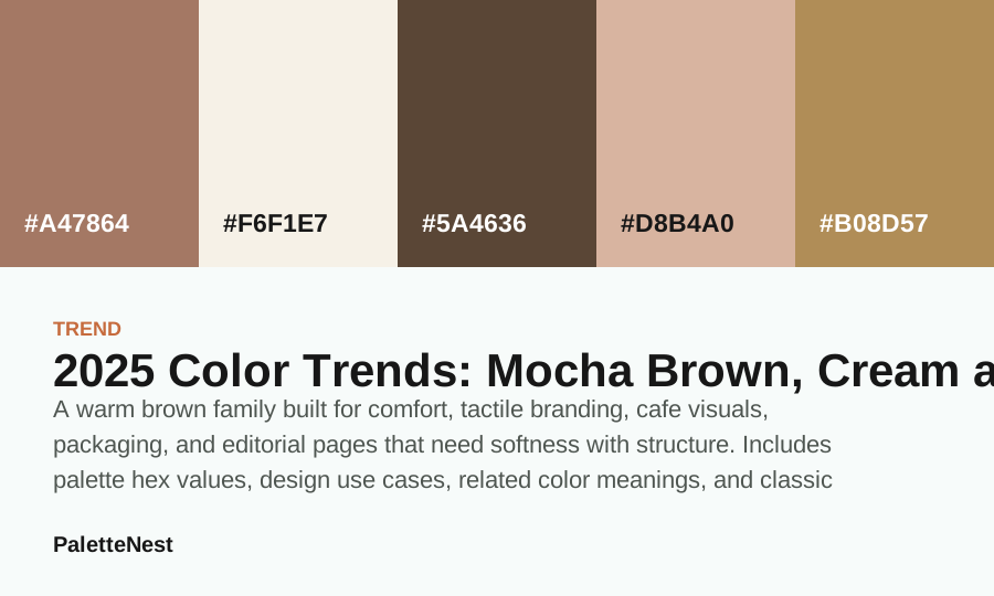
A warm brown family built for comfort, tactile branding, cafe visuals, packaging, and editorial pages that need softness with structure.
source signal
Pantone selected Mocha Mousse for 2025. PaletteNest translates that signal into a practical brown-neutral content palette for web, interiors, and brand articles.
why it matters
Mocha-style browns give neutral sites more emotional weight than gray. They feel grounded, edible, handmade, and slower without becoming rustic by default.
how to use it
Use cream as the reading surface, mocha as the main brand color, deeper espresso for headings, and champagne or dusty rose as the accent layer.
Pair mocha neutrals with black for luxury, terracotta for warmth, or dusty blue when the page needs a cooler counterweight.
related colors
related palettes
classic pairings
Short answer
short answer
A warm brown family built for comfort, tactile branding, cafe visuals, packaging, and editorial pages that need softness with structure. A trend article is most useful when it turns a headline color into practical decisions: what to use as the field, what to use as an accent, which colors make the palette more commercial, and which combinations make it more editorial or emotional.
Mocha-style browns give neutral sites more emotional weight than gray. They feel grounded, edible, handmade, and slower without becoming rustic by default. This is why the page treats the trend as a palette system rather than a single isolated swatch. A single color can start the story, but the surrounding colors determine whether the result feels calm, premium, playful, seasonal, or brand-ready.
contents
color values
| Color | Hex | Role | Use note |
|---|---|---|---|
| Field | #A47864 | Anchor | Use for the main mood or the first repeated brand signal. |
| Cream | #F6F1E7 | Surface | Use for large quiet areas, reading backgrounds, or room surfaces. |
| Espresso Brown | #5A4636 | Support | Use to connect the anchor and the accent without flattening the palette. |
| Blush Pink | #D8B4A0 | Depth | Use for headings, structure, shadows, trim, or formal contrast. |
| Gold | #B08D57 | Accent | Use in small repeated moments so the palette has energy without noise. |
application
Use cream as the reading surface, mocha as the main brand color, deeper espresso for headings, and champagne or dusty rose as the accent layer. The practical move is to choose a role before choosing a color. If the trend color becomes a background, it needs a text-safe companion. If it becomes an accent, it needs enough quiet space around it. If it becomes a brand color, it needs a neutral system that can repeat across pages.
Pair mocha neutrals with black for luxury, terracotta for warmth, or dusty blue when the page needs a cooler counterweight. For content sites, use the trend as a section signal, article illustration palette, download card, or seasonal feature band. Avoid turning every card, button, and paragraph into the trend color at the same time.
compare
mistakes
The first mistake is treating a trend as a command instead of a signal. A yearly color direction should help a designer ask better questions about surfaces, accents, contrast, materials, and audience fit. It should not replace the work of testing the palette in the actual page, room, package, or brand system.
The second mistake is copying only the headline color and ignoring the support system. A trend becomes useful when it has a quiet field, a readable depth value, one or two supporting colors, and a documented accent role. Without those pieces, the page becomes a mood board instead of a practical reference.
trend context
The practical value of the 2025 story is not that every designer should copy one named shade. It is that mocha neutrals points to a broader design problem: how to make a page, room, product, or brand feel current while still keeping the content readable and the system reusable. PaletteNest treats the year as a signal, then translates that signal into field colors, depth values, support tones, and restrained accents that can survive real production work.
That distinction matters because public trend pages often create attention around one color name, while search visitors need a usable plan. A designer needs to know what can become the background, what can hold text, what can mark emphasis, what should remain seasonal, and what should be tested in print, fabric, photography, or interface states. The article expands the signal into those decisions so the trend becomes useful instead of decorative.
palette roles
Start with #A47864 as the likely field or atmosphere color, then test #F6F1E7 as the color that carries memory. The field color should make long text, screenshots, products, or room surfaces feel stable. The signal color should appear often enough to be remembered but not so often that it erases the rest of the system. This role split is what turns a trend into a palette.
Use #D8B4A0 as a soft support when the palette needs more nuance, and keep #B08D57 available for headings, trim, navigation, packaging details, or formal contrast. A trend palette without depth can feel unfinished. A trend palette without a quiet support can feel harsh. A trend palette without a field color can feel like a collection of accents rather than a usable article, brand, or space.
commercial use
For commercial work, treat the trend as an editable kit. A brand can borrow the atmosphere, one accent, or one neutral relationship without adopting the exact public formula. That keeps the design from looking like a trend copy and reduces the risk of implying that the project has licensed a proprietary color system. The safest move is to choose independent hex values, document the inspiration boundary, and test the palette in the brand's own assets.
Use the trend first in places that are easy to revise: campaign bands, article illustrations, social graphics, seasonal packaging, email headers, window signage, and downloadable palette cards. Keep permanent navigation, body text, legal information, and product details on stable surfaces. This lets a team feel current while protecting the parts of the experience that must stay readable for months or years.
content pages
A long article needs color to organize information. Use the lightest value as the reading field, the deepest value for headings or navigation, the signal color for section identity, and the support color for related links or callouts. The palette should help the reader move from the short answer into tables, examples, mistakes, FAQ, and source notes without getting visually tired.
The main failure mode is decorating every block equally. If every card, divider, button, and pull quote uses the signal color, the page becomes visually busy and the trend stops feeling special. Let the color appear in a few repeated roles. The reader should be able to understand the answer, copy the values, and choose the next article before noticing how carefully the palette has been applied.
brand systems
A brand can use mocha neutrals as a seasonal layer or as a longer-term identity cue, but those are different decisions. Seasonal use can be bolder because it appears in campaigns, landing pages, announcement graphics, or product drops. Identity use must be quieter and more repeatable because it will appear in invoices, footers, forms, help pages, labels, and routine social templates.
Before adopting the palette, test it against competitors and category expectations. If everyone in the category is using the same color story, distinctiveness may come from proportion, typography, photography, material, or a sharper accent rather than from the headline trend color. A trend can make a brand feel timely, but only the full system can make it feel owned.
interiors
Rooms turn digital color into material, so the palette needs a surface plan. A wall, sofa, rug, curtain, cabinet, tile, lamp, frame, and flower arrangement will each shift the color through texture and light. Use the gentlest value for the largest surface unless the room can support a strong mood for a long time. Reserve sharper accents for objects that can change.
Always sample under the actual light. Morning daylight, warm bulbs, glossy tile, matte paint, linen, velvet, metal, and wood can make the same color family feel cleaner, duller, warmer, or heavier. The 2025 palette is ready for a room only when the main surface, trim, textile, and accent still work together after the light changes.
weddings and events
Weddings and events need color that photographs well and survives repetition across stationery, flowers, attire, table settings, signage, and lighting. A trend shade can be beautiful as a focal accent but overwhelming as the only design idea. Use it in the details guests will remember, then give the rest of the scene a stable neutral and a readable depth color.
The event palette should also account for people. Dresses, suits, flowers, table linens, menus, candles, and venue walls all carry color beside skin tones and photography. A softened version of the trend often looks more expensive in photos than the pure headline shade. The goal is a coherent memory, not a perfectly literal swatch match.
packaging
Packaging has a harder job than a mood board because it must be read quickly. The trend color can mark product family, flavor, scent, season, or campaign, but the product name, ingredients, legal copy, and important usage information need a reliable field and strong contrast. A beautiful package still fails if the shopper cannot read it from a shelf or phone camera.
For multi-product systems, keep the field and depth colors stable, then vary the support or accent. This gives the line a recognizable structure while letting each item feel specific. The 2025 direction becomes more useful when it produces a repeatable packaging grammar rather than a single attractive front panel.
pairing logic
Choose companions by the problem they solve. If the trend feels too soft, add depth. If it feels too heavy, add a lighter surface. If it feels too cool, add a warmer neutral. If it feels too familiar, adjust proportion or introduce a more specific accent. This keeps the choice grounded in function rather than taste alone.
The strongest companion is often not the most exciting swatch. It is the one that makes the rest of the system easier to use. A quiet bridge can make a bold accent feel intentional. A deep text value can make a soft palette credible. A muted support can connect the trend color to photography, room materials, or brand assets.
mistake diagnosis
Trend pages become thin when they repeat the color name without explaining decisions. A useful article should show role tables, examples, proportions, mistakes, related links, and sources. It should explain how the palette changes across web pages, rooms, brands, weddings, packaging, and tools. Otherwise the reader gets inspiration but not judgment.
The same problem appears inside designs. If a palette uses only one fashionable color and no supporting system, it can feel like a temporary skin. Add a field, a bridge, a depth value, a support tone, and a controlled accent. Those roles make the color story feel designed instead of pasted on.
accessibility
Trend colors are not exempt from readability. Test real headings, paragraph text, button labels, table cells, captions, form inputs, and navigation states. A color that works on a large banner may fail on a small mobile chip. The exact foreground and background pair matters more than the emotional story attached to the hue.
Do not use trend color alone to communicate meaning. If it marks a selected state, category, alert, seasonal product, or active filter, support it with text, shape, icon, underline, border, or placement. This keeps the information understandable for more readers and makes the design more robust across displays and lighting conditions.
source note
This article uses public trend references as editorial context. It does not claim to reproduce Pantone, WGSN, Coloro, paint-brand, textile, or proprietary color formulas. The hex values here are independent practical companions chosen for article examples, palette roles, and design translation. Production projects should choose and test their own exact values.
That boundary is part of the content quality. Readers can use the trend direction without being misled about precision. The page is more useful when it explains how to translate the signal, where the signal may not fit, and what to test before using the palette commercially.
workflow
First, write the job of the project in one sentence. Then choose the field color, text depth, signal color, support tone, and accent. Build the first version with unequal proportions. Place real content into the layout. Check small surfaces. Open related color meaning and combination articles when the palette needs more evidence.
Second, remove anything that does not have a job. Trend palettes often fail because teams keep adding colors to make the system feel richer. A cleaner system usually comes from fewer visible colors, stronger contrast, and clearer repetition. The palette should make decisions easier, not create more options than the project can use.
quality control
A search-ready trend page should answer the query quickly, then earn depth through practical sections. It should include a short answer, table of contents, value table, use cases, pairing logic, mistakes, FAQ, related articles, source notes, and author/editor/date details. Those modules make the article scannable and show that the page is more than a trend summary.
The final check is link and source quality. The page should link to relevant color meanings, palette articles, combinations, tools, and the trend archive. Outbound source links should be official or authoritative, use HTTPS, and remain reachable. The article should make it easy for readers and crawlers to understand where the color story came from and where to go next.
decision handoff
A trend palette should end with a short handoff note that another person can use. Name the field color, signal color, support tone, depth value, and accent. Explain where each one is allowed to appear and where it should not be used. The handoff turns a visual direction into a repeatable system for designers, writers, builders, and clients.
The handoff should also include the source note: public trend references inspired the direction, but final production values are independent and must be tested. That sentence prevents the team from treating the article as a licensed formula while still preserving the useful insight from the annual color story.
For search readers, include the next step in the handoff. Tell them whether to open a palette article, a color meaning page, a combination guide, or a tool. A trend article is strongest when it moves the reader from annual inspiration into a specific, testable color decision with values, examples, sources, and mistakes visible.
faq
sources
Trend references are used as public editorial signals. PaletteNest does not claim licensed Pantone, WGSN, Coloro, or paint-brand formulas; the palettes here are practical companion systems built from independent hex values.
Pantone selected Mocha Mousse for 2025. PaletteNest translates that signal into a practical brown-neutral content palette for web, interiors, and brand articles. PaletteNest uses public trend signals as editorial starting points and then builds practical companion palettes for designers, content teams, wedding planning, interiors, and small brand systems. The goal is usable color guidance, not a claim that every project must follow a single annual color.
Last updated by PaletteNest Editorial Desk on 2026-05-03.