Warm Gold #B08D57
Adds formal contrast and evening polish.
weddings / formal branding / living rooms
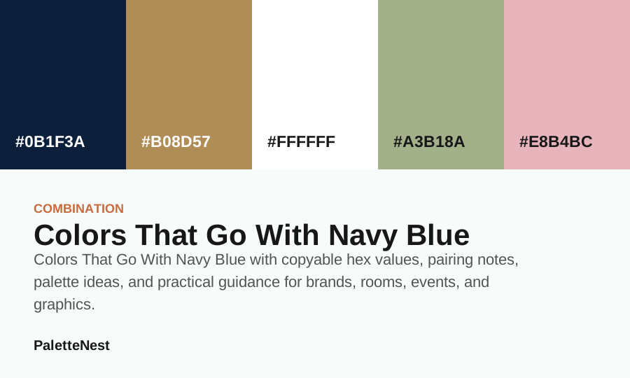
Colors That Go With Navy Blue with copyable hex values, pairing notes, palette ideas, and practical guidance for brands, rooms, events, and graphics.
Adds formal contrast and evening polish.
Keeps navy clean, nautical, and easy to read.
Softens the depth with organic calm.
Makes navy feel romantic without turning pastel.
Short answer
short answer
Colors That Go With Navy Blue is a practical pairing question, not just a list of attractive accents. The answer depends on what the base color needs to do: create trust, add warmth, soften a room, support a wedding palette, make packaging readable, or give a brand system a stronger point of view.
This guide starts with #0B1F3A and compares companion colors for weddings, formal branding, living rooms. Each companion has a different job, so the strongest palette is usually the one that chooses one clear mood instead of using all pairings equally.
contents
color values
| Color | Hex | Role | Use note |
|---|---|---|---|
| Navy Blue | #0B1F3A | Anchor | Use for the main mood or the first repeated brand signal. |
| Gold | #B08D57 | Surface | Use for large quiet areas, reading backgrounds, or room surfaces. |
| White | #FFFFFF | Support | Use to connect the anchor and the accent without flattening the palette. |
| Sage Green | #A3B18A | Depth | Use for headings, structure, shadows, trim, or formal contrast. |
| Blush Pink | #E8B4BC | Accent | Use in small repeated moments so the palette has energy without noise. |
page differentiation
This article owns the companion decision for navy blue: the base is fixed, and the reader needs to know whether gold, white, sage, or blush changes the mood in the right direction.
pair by pair
layout use
A reliable structure is base color for the anchor, neutral for the reading surface, one pairing color for emphasis, and one quieter color for secondary details. In interiors this becomes walls, textiles, wood or metal, and small decor. In branding it becomes logo, background, call to action, and supporting graphics.
If the combination feels heavy, increase the amount of neutral space before changing the colors. If it feels too plain, add a warm or cool accent in a small area. This gives the palette movement while keeping the original pairing readable.
search intent
People usually search this question because they already like the base color but do not know how to finish the palette. The useful answer should explain what each companion changes: whether it makes the base calmer, warmer, sharper, more formal, more romantic, more natural, or easier to read.
The companions in this article include Warm Gold, Crisp White, Sage Green, Blush. They are not meant to be used all at full strength. They are options for different situations, and the best combination is the one that supports the specific room, brand, event, package, interface, or content surface.
proportion
Let navy blue remain the anchor unless the design goal has changed. Use a neutral or quiet value for the largest readable surface, a darker value for structure, and one companion for emphasis. A fourth companion can stay as a seasonal or secondary option instead of appearing in the same first screen.
If the base color becomes a wall, hero background, package field, or large brand area, the companion should usually become smaller. If the base color is only a logo or small detail, the companion can take more space. Pairing quality depends on proportion as much as hue.
layouts
Web layouts need a readable field before they need more color. Place the base color in headings, section markers, cards, illustrations, or buttons only after the body text surface is safe. Then use the companion color to create emphasis, not to decorate every module equally.
In editorial pages, the pairing should help the reader move from short answer to table, examples, mistakes, FAQ, and related links. If the pairing hides hierarchy or makes links harder to identify, the colors are competing with the content.
rooms
In rooms and events, pairings become material decisions. The base can appear in walls, bridesmaid dresses, stationery, signage, or textiles. Companions can appear in flowers, wood, metal, candles, frames, ceramics, ribbons, menus, or small decor. The smaller details are often where stronger contrast works best.
Test the pairing in real light. A companion that looks balanced in a digital strip can become too warm, too gray, too bright, or too dull in fabric and paint. The safest physical palettes include at least one quiet bridge color and one deeper value for edges.
brand systems
For a brand, decide whether the companion should change recognition, price point, category signal, or emotional tone. A warm companion can make the base more human. A deep companion can make it more formal. A pale companion can make it more airy. A bright companion can make it more social or seasonal.
Packaging should use the pairing to clarify hierarchy. Keep legal copy, ingredients, product names, and important labels on readable surfaces. Use stronger companion colors for bands, icons, flavor marks, borders, or campaign details rather than tiny text.
diagnostics
If the pairing feels too soft, add depth before adding saturation. If it feels too formal, add a warmer bridge. If it feels too busy, remove one companion from the visible palette. If it feels generic, give the base color a more repeated role and let the companion become a sharper accent.
When two colors fight, look at value and area first. Two hues can technically pair well and still feel unpleasant when they have equal saturation and equal space. Let one color lead, one color support, and one neutral separate them.
accessibility
Hue contrast does not guarantee readable contrast. A warm accent and a cool base may look different as swatches, but small text can still fail if the lightness is too similar. Test actual foreground and background pairs, especially for buttons, captions, table cells, and navigation.
Also avoid using the companion color as the only signal. If color marks a category, selected state, warning, or link, pair it with text, shape, icon, underline, or placement so the information survives different displays and accessibility needs.
checklist
photography
Photography can make a pairing feel warmer, cooler, busier, or more muted than the swatches suggest. If images already carry a strong color cast, reduce the companion color in the layout and let the base color appear through typography, borders, or small repeated markers.
For product and room imagery, pull one supporting color from the actual photo instead of forcing a theoretical companion into every frame. The pairing should make the image set feel intentional, not disconnected from the content it frames.
seasonal layers
A base color can stay stable while its companion changes. Use lighter companions for spring or airy editorial work, warmer companions for autumn and handmade categories, deeper companions for formal or evening use, and cleaner neutrals when the design needs to feel more modern.
This is a useful way to keep a brand or room palette recognizable. The base color remains the memory. The companion changes the season, campaign, product line, or event tone without forcing a full redesign.
when not to use
A pairing article is a starting point, not a complete visual identity. If the project needs a full brand system, wedding guide, room plan, or editorial package, move into a palette article and assign roles to every color. Pairings explain relationship; palettes explain distribution.
Also step back if the base color does not match the audience. No companion can fully rescue a color that sends the wrong category signal. If the mood is wrong at the anchor level, choose a better base before refining the companions.
final read
The best combination is the one where each color has a reason to exist. One color leads, one creates the reading surface, one gives depth, and one changes the emotional temperature. Any extra companion should solve a specific problem or stay out of the first draft.
When a combination feels nearly right, do not keep adding colors. Change area, lightness, saturation, or bridge value first. Those adjustments usually preserve the original idea while making the final design easier to use.
quality control
Review the pairing in its smallest required surface before approving the large one. If the colors cannot handle a mobile card, a caption, a price label, a room detail photo, or a one-line navigation item, they are not ready for a full hero, wall, package, or campaign system.
The final test is whether the base color still feels like the base after companions are added. If the companion takes over, reduce its area or move it to a seasonal role. A good pairing should support the anchor, not replace it by accident.
decision summary
When several companions seem possible, choose the one that solves the most urgent problem. Use the companion that improves readability if the design feels weak, the one that adds warmth if the base feels cold, the one that adds depth if the system feels pale, and the one that adds softness if the base feels too formal. This keeps the final choice tied to function. A pairing chosen for a clear job is easier to repeat, defend, and revise.
mistakes
faq
sources
Pairing advice is editorial and practical. Each companion color is treated as a role in a palette, not as a single correct answer for every brand, room, event, or interface.
Last updated by PaletteNest Editorial Desk on 2026-05-20.