sage green palette
Sage green palette
Use this page when the reader already wants sage green and needs a complete usable palette.
palettes
Copy a full palette, open the detail page, or download a generated SVG card from the tool surface.
search intent map
sage green palette
Use this page when the reader already wants sage green and needs a complete usable palette.
nature
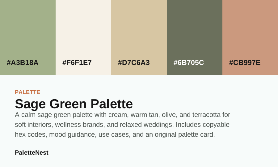
A calm sage green palette with cream, warm tan, olive, and terracotta for soft interiors, wellness brands, and relaxed weddings.
wedding
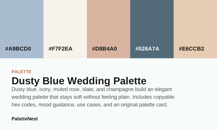
Dusty blue, ivory, muted rose, slate, and champagne build an elegant wedding palette that stays soft without feeling plain.
aesthetic
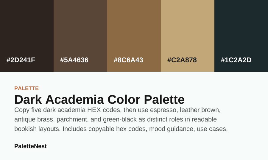
A dark academia palette built from espresso brown, leather, brass, parchment, and deep green-black for grounded dramatic layouts.
coastal
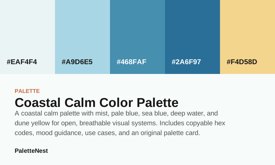
A coastal calm palette with mist, pale blue, sea blue, deep water, and dune yellow for open, breathable visual systems.
luxury
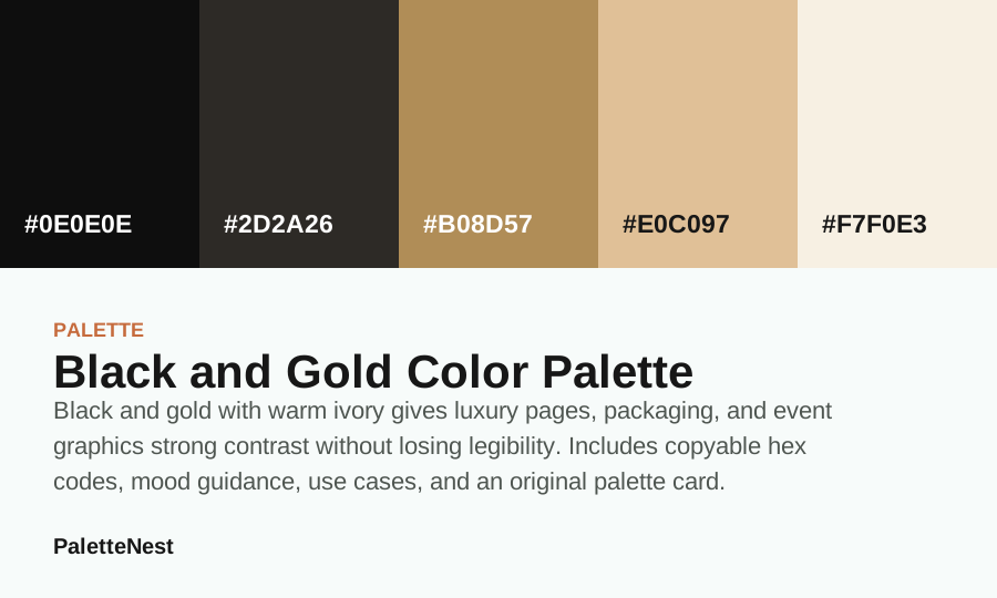
Black and gold with warm ivory gives luxury pages, packaging, and event graphics strong contrast without losing legibility.
pastel
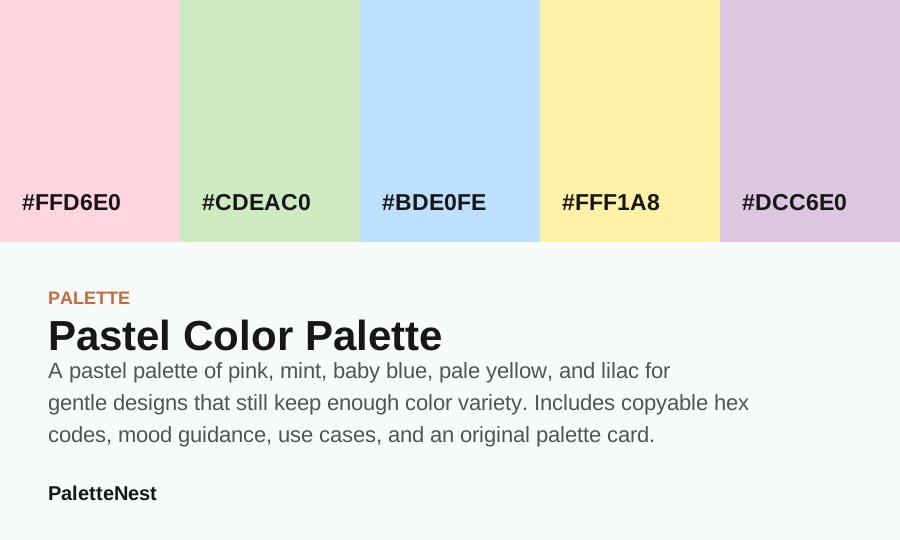
A pastel palette of pink, mint, baby blue, pale yellow, and lilac for gentle designs that still keep enough color variety.
earth
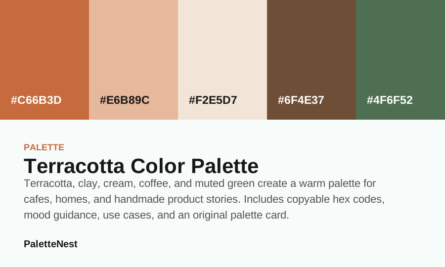
Terracotta, clay, cream, coffee, and muted green create a warm palette for cafes, homes, and handmade product stories.
neutral
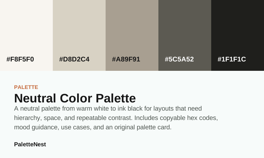
A neutral palette from warm white to ink black for layouts that need hierarchy, space, and repeatable contrast.
floral
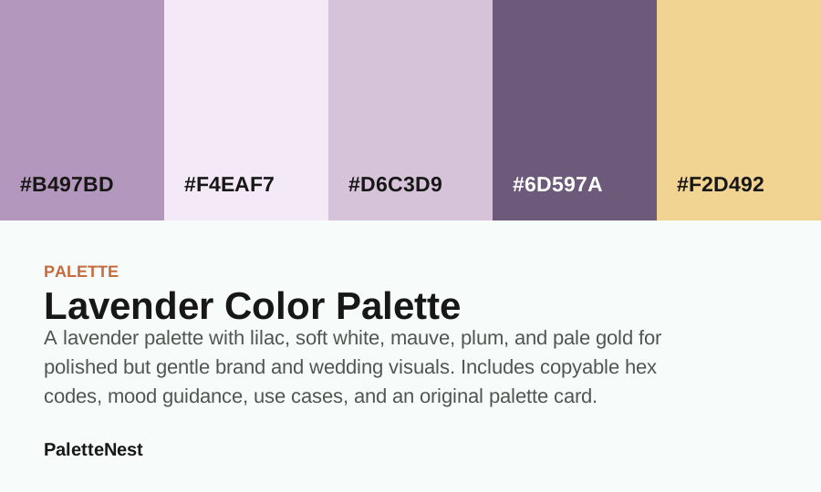
A lavender palette with lilac, soft white, mauve, plum, and pale gold for polished but gentle brand and wedding visuals.
short answer
A good palette is not only five attractive colors. It is a system of jobs: one anchor, one quiet surface, one support color, one depth color, and one accent. When those jobs are clear, the palette can work across articles, rooms, brand assets, wedding stationery, packaging, and interface states without becoming random.
Open a palette page when you need copyable hex values, a role table, use cases, pairing logic, mistakes, FAQ, related links, and an original palette card. The detail page is where a swatch set becomes design guidance.
featured guide
The sage green palette is a strong starting guide because it connects a popular color meaning to practical companion colors: cream, warm tan, olive, and terracotta. It can support wellness brands, bedroom ideas, relaxed weddings, product cards, and soft editorial layouts.
Use the palette article to decide which color should dominate, which color should hold text, and which accent should stay small. Copying all five colors into equal blocks is usually the fastest way to make a palette feel less polished.
comparison
A palette that looks beautiful as a strip can still fail in a real layout. Test it with the longest headline, smallest label, product image, room material, paper stock, or mobile view you expect to use. The right palette is the one that still gives readers hierarchy after the decorative impression fades.
For deeper decisions, move between color meanings, color combinations, and the complementary colors guide. The pages are designed to link into each other as a color reference system.
Short answer
short answer
A useful palette is not five equal swatches. It is a role system: one anchor, one surface, one support, one depth color, and one accent. The same five colors can feel polished or chaotic depending on how much space each color receives.
Use this index to compare mood and use case, then open a full palette article for role tables, implementation notes, common mistakes, related links, and source notes.
contents
color values
| Color | Hex | Role | Use note |
|---|---|---|---|
| Sage Green | #A3B18A | Main mood | The repeated color readers remember first. |
| Cream | #F6F1E7 | Reading field | The quiet color that lets text and swatches breathe. |
| Beige | #D7C6A3 | Bridge | The color that connects anchor and accent without flattening hierarchy. |
| Olive Green | #6B705C | Structure | The darker value for headings, trim, or grounding. |
| Terracotta | #CB997E | Energy | The small repeated color that keeps the palette from feeling static. |
use cases
pairing logic
When a palette feels wrong, the problem is often role conflict rather than color choice. Two colors may both try to be the anchor, or no color may be dark enough for text. Fix the role before replacing swatches.
A five-color palette can also be used as a three-color system. Choose the anchor, surface, and depth first; then add support and accent only when the design needs more nuance.
mistakes
faq
sources
Index pages are edited as navigation and decision surfaces. They summarize the library, link to complete guides, and keep experimental tool states separate from public reading pages.
This page is reviewed as an index, so the goal is not to repeat every article in full. The goal is to show the library structure, identify the strongest article paths, and keep readers moving from broad color intent into specific, source-aware articles.
Last updated by PaletteNest Editorial Desk on 2026-05-19.