color articles
Palette guide
Dusty Blue Wedding Palette
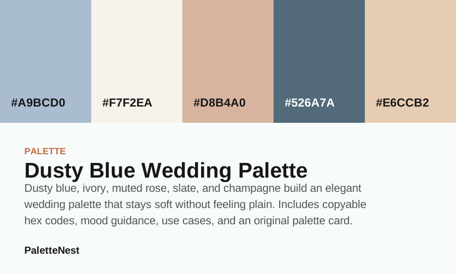
Dusty blue, ivory, muted rose, slate, and champagne build an elegant wedding palette that stays soft without feeling plain.
- Mood
- romantic airy
- Use for
- ceremony, stationery, bridesmaid styling
- System
- 5 linked colors
Color values#A9BCD0 / #F7F2EA / #D8B4A0 / #526A7A / #E6CCB2
Swatches link to color articles. The palette card is an original visual built from the listed hex values.
contents
What this article covers
- Short answerWhat the palette is best for and how the five colors divide responsibility.
- Page focusWhy this palette page is distinct from nearby color, combination, and use-case articles.
- Color valuesEvery hex value with a suggested role for layout, print, interiors, or brand work.
- Suggested rolesWhich color leads, supports, deepens, or acts as a controlled accent.
- UsageHow to apply the palette without forcing every swatch into every screen.
- Mistakes and FAQCommon palette failures, contrast checks, and practical implementation answers.
Short answer
short answer
How the dusty blue wedding palette works
Dusty blue, ivory, muted rose, slate, and champagne build an elegant wedding palette that stays soft without feeling plain. The important detail is not only the five hex values; it is how those values divide responsibility. A strong palette needs a main color, a background color, a text or depth color, and one or two accents that can appear in small controlled areas.
This palette is built for ceremony, stationery, bridesmaid styling. It reads as romantic airy, which means it should be used with enough neutral space to let the mood come through without turning the whole design into a flat color wash.
color values
Hex values and practical roles
| Color | Hex | Role | Use note |
|---|---|---|---|
| Dusty Blue | #A9BCD0 | Anchor | Use for the main mood or the first repeated brand signal. |
| Cream | #F7F2EA | Surface | Use for large quiet areas, reading backgrounds, or room surfaces. |
| Blush Pink | #D8B4A0 | Support | Use to connect the anchor and the accent without flattening the palette. |
| Slate Blue | #526A7A | Depth | Use for headings, structure, shadows, trim, or formal contrast. |
| Gold | #E6CCB2 | Accent | Use in small repeated moments so the palette has energy without noise. |
page differentiation
Why this article is different
This article is built around wedding pacing: dusty blue has to photograph softly, support ivory paper, and still leave enough contrast for names, menus, and signage.
- Keep separate from
- Do not let it collapse into a generic blue palette; the page should keep returning to ceremony light, bridesmaid fabric, stationery, florals, and reception materials.
- Proof scenario
- The proof scenario is a wedding suite where dusty blue leads, ivory keeps paper readable, muted rose adds warmth, slate controls structure, and champagne finishes small details.
- Use another page when
- Avoid this route when the reader wants coastal content or corporate blue; send them to coastal calm or navy pairing decisions instead.
- Dusty Blue Wedding ColorsUse this for the wider ceremony and reception plan.
- Blue MeaningUse this to explain trust, calm, and distance before choosing materials.
- Coastal Calm Color PaletteUse this if the same blue family needs a travel or home-decor direction.
roles
Suggested roles for each color
- #A9BCD0 works best as the anchor color. Test the role in a real layout before committing it to every surface.
- #F7F2EA works best as the quiet surface. Test the role in a real layout before committing it to every surface.
- #D8B4A0 works best as the supporting neutral. Test the role in a real layout before committing it to every surface.
- #526A7A works best as the depth color. Test the role in a real layout before committing it to every surface.
- #E6CCB2 works best as the accent or highlight. Test the role in a real layout before committing it to every surface.
usage
How to apply this palette in a real design
Use the lightest value for large reading surfaces and the deepest value for headings, navigation, or small structural details. The middle colors should connect the two extremes: cards, dividers, illustrations, packaging panels, invitation details, or secondary brand assets.
When the design needs more polish, reduce the number of colors visible at once. A five-color palette does not mean all five colors must appear in every screen. Most layouts work better with two main colors, one background, and one restrained accent.
pairing logic
How the palette pairings hold together
The palette works when the colors have unequal jobs. Let #A9BCD0 carry the first impression, use #F7F2EA as the breathing surface, and reserve #E6CCB2 for controlled emphasis. The remaining values should connect those poles so the palette feels intentional rather than like five separate favorites.
If the palette is used for a website, apply the darkest value to headings and navigation before using it on buttons. If it is used for interiors or events, test the anchor color on the largest surface first, then introduce accent colors through textiles, flowers, packaging, signage, or small repeated details.
search intent
What readers need from the dusty blue wedding palette
A reader opening this palette is usually trying to move from mood into execution. They may like the colors already, but they still need to know which value should lead, which value can hold text, which value should stay quiet, and which value should appear only in small repeated accents.
That is why the article treats dusty blue wedding palette as a working kit. The palette should answer how to build a page, room, wedding board, package, social graphic, or brand system without forcing every swatch into every moment.
proportion
A practical proportion model
Start with a rough 60-25-10-5 model. Give the quietest surface the largest area, give the anchor enough repetition to be remembered, give the depth color structural work, and keep the accent small. The exact numbers can change, but unequal proportion is what makes the palette feel designed.
For dusty blue wedding palette, the anchor is #A9BCD0, the likely surface is #F7F2EA, and the strongest emphasis should be tested carefully before it expands. If the design feels busy, remove a color from the first screen rather than adding another separator.
content layouts
How the palette behaves on content pages
Content pages need hierarchy more than decoration. Use the lightest value for article surfaces, the deepest value for headings and navigation, and the accent for related links, table labels, or small markers. Avoid placing long paragraphs on saturated or mid-tone colors unless the exact contrast has been checked.
The palette should help a reader scan from title to short answer, then into tables, examples, mistakes, FAQ, and related articles. If the colors make those sections harder to distinguish, the palette is being used as ornament rather than structure.
brand systems
How to document the palette for a brand
A palette becomes easier to reuse when each value has a written job. Document which color is the primary recognition color, which one is for backgrounds, which one is for body text, which one supports illustration, and which one is seasonal or promotional. This prevents future assets from using every color at once.
Also document what not to do. For example: do not put small text on the accent, do not use the support color as the only divider, and do not replace the depth color with a lighter value when the layout needs authority. Negative rules protect the system as much as positive examples.
interiors and events
How to translate the palette into physical materials
Physical uses need material hierarchy. Assign the surface color to walls, stationery paper, table linen, or packaging field. Assign the anchor to repeated objects. Assign the accent to details that can change seasonally. Assign the depth value to trim, type, frames, signage, or small grounding elements.
Test large samples before trusting a digital strip. Wall light, paper texture, fabric weave, flowers, wood undertone, and photography can all shift the palette. A color that feels balanced on screen may need a warmer, darker, or quieter version when it becomes material.
diagnostics
How to fix the palette when it feels wrong
If the palette feels flat, add more value contrast before changing hue. If it feels loud, reduce accent area before lowering saturation. If it feels cold, warm the neutral bridge. If it feels dated, simplify the number of visible colors and let typography do more work.
Diagnose the job that is failing. A missing surface creates clutter. A missing depth color creates weak hierarchy. An overused accent creates noise. A weak anchor creates forgettable branding. Fixing the role is usually faster than replacing the entire palette.
accessibility
Contrast and interaction checks
Every palette article should be tested with long headings, paragraphs, table cells, captions, buttons, inputs, links, and disabled states. The most beautiful palette still fails if a reader cannot distinguish what is clickable, what is selected, and what information matters first.
Do not use color alone for state. Pair color with labels, icons, borders, underlines, weight, or placement. This makes the design clearer for accessibility and usually improves scanning for everyone else as well.
checklist
Palette publishing checklist
- Assign each color a role before using it in a finished layout.
- Test the lightest and darkest values with real text and mobile labels.
- Use fewer colors on the first screen than the palette technically contains.
- Document the surfaces where the accent is allowed to appear.
- Compare the palette against related color meaning and combination articles before publishing.
photography
How photography changes the palette
A palette rarely lives beside flat color alone. Product photos, room photos, portraits, food images, and editorial graphics introduce extra hues. Before publishing, place the palette beside the most common image type. If the photo already contains a strong warm or cool cast, one accent may need to become quieter.
This is especially important for content sites and ecommerce pages. The palette should frame the image, not compete with it. Use the surface and depth colors to stabilize the page, then let the anchor or accent echo a color that appears naturally in the image set.
seasonal layers
How to adapt the palette over time
A strong palette can support seasonal changes without being rebuilt. Keep the anchor, surface, and depth values stable. Let campaign illustrations, secondary accents, photography direction, or related article cards carry the seasonal movement.
If the palette needs to feel warmer, increase the presence of the warmest companion. If it needs to feel fresher, increase the light surface and reduce the deepest value. If it needs to feel more premium, use more depth and less accent area.
governance
Write simple rules so the palette survives reuse
A palette used by more than one person needs rules. Name the primary background, primary text color, allowed button color, allowed accent surfaces, and colors that should never carry small text. This small note prevents future pages from drifting into inconsistent color decisions.
Good governance also helps SEO pages. If every article uses colors with the same role logic, readers can scan quickly from short answer to table to examples to FAQ. Consistent palette behavior makes the content feel more trustworthy.
final read
The practical rule for this palette
The palette is strongest when it makes decisions easier. If a new screen, room, label, or graphic becomes harder to read after applying the colors, simplify the palette before adjusting the content. Color should clarify the hierarchy, not ask the reader to work harder.
Return to the five roles whenever the design drifts: anchor, surface, support, depth, and accent. That role language is more durable than a mood label because it tells a designer exactly what each swatch should do next.
quality control
How to review the palette before use
Review the palette in the smallest and most boring places: mobile navigation, table cells, captions, form labels, footer links, printed notes, and low-light photos. If those surfaces still work, the palette is much more likely to survive the beautiful showcase moments.
If a color only works in a large block, document that limit. If a color cannot carry text, keep it away from labels. If an accent starts appearing everywhere, move it back into a smaller role before the whole system becomes noisy.
mistakes
Common palette mistakes to avoid
The most common mistake is using every swatch at equal strength. That makes the palette feel busy even if the individual colors are attractive. The second mistake is putting body copy on an accent color without testing readability. The third mistake is choosing colors by mood only and forgetting hierarchy.
A good palette should help a user know where to look first, what is interactive, what is decorative, and what belongs to the same family of content. If the palette does not make those jobs easier, simplify it before adding new colors.
faq
Dusty Blue Wedding Palette FAQ
- What is the main color in the dusty blue wedding palette?
- The first swatch, #A9BCD0, should be treated as the anchor color. The other values support backgrounds, contrast, accents, and secondary surfaces.
- Should all five colors appear at once?
- No. Use the palette as a system of options. Most designs work better when two colors dominate, one color supports reading surfaces, and one accent appears in small repeated moments.
- How should this palette be tested before publishing?
- Place real headings, body copy, buttons, product photos, or room materials into the palette. A swatch set is only ready when the hierarchy still reads clearly in context.
sources
Sources and editorial note
Palette advice is based on visible color relationships, role assignment, contrast testing, and design-use patterns. Original palette cards are built from the listed hex values.
- W3C CSS Color Module Level 4Technical color notation reference for copyable palette values.
- WCAG contrast minimum guidanceUsed to keep palette advice tied to readable foreground and background pairs.
Last updated by PaletteNest Editorial Desk on 2026-06-04.