occasion

Best Colors for a Wellness Brand

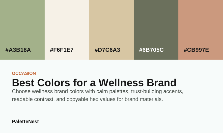
Choose wellness brand colors with calm palettes, trust-building accents, readable contrast, and copyable hex values for brand materials.

Original wellness brand color board.

composition

Sage Green Palette

Sage Green Palette supports best colors for a wellness brand with calm organic roles for wellness, bedroom, wedding; use #A3B18A as the lead value, then test proportion, contrast, materials, and next links in the full article.

Visuals on this page are original color boards built from the listed values. External photos appear only when a clear source and commercial-use permission are available.

short answer

How to use best colors for a wellness brand

Choose wellness brand colors with calm palettes, trust-building accents, readable contrast, and copyable hex values for brand materials. The page starts with a practical palette because color decisions become easier when the roles are clear: one color for the main mood, one color for the background, one color for contrast, and one or two colors for accents.

For this topic, sage green palette gives a useful starting point because it is calm organic and supportswellness, bedroom, wedding. Treat the palette as a planning kit rather than a strict rule. Adjust contrast, warmth, and saturation to match the room, brand, event, or content surface.

contents

What this article covers

  1. Short answerThe fastest role-based way to use the palette in the scene.
  2. Color valuesCopyable values and surface, anchor, depth, support, and accent roles.
  3. Use casesDominant surfaces, materials, photography, brand, room, or wedding application.
  4. Pairing logicHow to adjust proportion before adding more colors.
  5. Mistakes and FAQWhat usually goes wrong and how to test the final plan.

color values

Hex values and practical roles

ColorHexRoleUse note
Sage Green#A3B18AAnchorUse for the main mood or the first repeated brand signal.
Cream#F6F1E7SurfaceUse for large quiet areas, reading backgrounds, or room surfaces.
Beige#D7C6A3SupportUse to connect the anchor and the accent without flattening the palette.
Olive Green#6B705CDepthUse for headings, structure, shadows, trim, or formal contrast.
Terracotta#CB997EAccentUse in small repeated moments so the palette has energy without noise.

steps

A practical way to build the color plan

  1. Choose the dominant surface first, because large areas control the emotional temperature of the whole design.
  2. Pick a readable contrast color for headings, labels, or important objects before adding decorative accents.
  3. Use the accent color in repeated small moments so the palette feels intentional instead of scattered.
  4. Check the palette in the actual context: screen, print, fabric, wall color, packaging, or photography.

scenario planning

Translate the palette into actual surfaces

A use-case page becomes useful when it names the surfaces the colors will touch. For a room, that means wall color, textiles, wood, metal, art, trim, and daylight. For a brand, that means logo, navigation, labels, product photos, email, packaging, and tiny UI states. For an event, that means stationery, flowers, dresses, signage, table settings, and photos.

Treat the palette as a planning map. The anchor should carry the first impression, the surface should keep the scene readable, the depth color should define edges, and the accent should appear in repeated details. If every color appears in every object, the plan loses hierarchy.

pairing logic

Use proportion before adding more colors

If the plan feels unfinished, adjust area before adding another swatch. Give the quietest color more space when the scene feels busy. Give the depth color more structure when the scene feels washed out. Give the accent less area when it starts to dominate the mood.

A practical first draft is one large surface, one repeated anchor, one deep structural color, and one small accent. This keeps the palette flexible enough for photos, articles, room samples, invitations, product cards, and social crops.

dominant surface

Choose the dominant surface for best colors for a wellness brand

The first decision is not the accent. It is the dominant surface: logo field, menu background, packaging label, website section, or social template system. That surface sets the emotional temperature for the whole scene. If it is too saturated, everything else has to work harder. If it is too pale, the plan can look unfinished. Choose the largest color with the longest viewing time in mind, then build the rest of the palette around that decision.

For sage green palette, the surface color should create calm, readable space while the anchor color repeats in places the viewer will remember. This is why the role table matters. A use-case page is ready for search only when it explains where each swatch goes, how much area it should receive, and what problem it solves in the real scene.

materials

Test best colors for a wellness brand with real materials

The palette needs to be tested against signage, labels, paper, product photography, digital UI, print menus, email headers, and small legal copy. A digital hex value is useful for planning, but material changes perception. Matte paper softens color. Glossy packaging sharpens it. Window light cools it. Warm bulbs deepen it. Fabric weave can make a color look grayer or more saturated. The final choice should be made with samples or mockups, not only a screen strip.

This is especially important when the palette moves across more than one medium. A wedding invitation, brand website, room wall, menu, label, sign, social post, and photograph will not show the same color identically. Use the hex values as documentation, then adapt the production value so the intended role still works in the actual medium.

application

Apply the palette by role, not by equal matching

Use the anchor for recognition, the surface for readable content, the depth value for names and navigation, and the accent for product families or campaign details.

The most dependable proportion is unequal. Give the quietest field the most area, let the anchor appear often enough to create memory, use the depth value wherever information must be read, and keep the accent in moments that benefit from attention. If every color is used at the same volume, the scene loses hierarchy and the viewer cannot tell what matters first.

proportion

A practical proportion model for best colors for a wellness brand

Start with 55 to 65 percent surface, 15 to 25 percent anchor, 10 to 15 percent support, 5 to 10 percent depth, and a very small accent. The numbers are not strict, but they force the plan to have priorities. A search visitor should be able to understand which color leads and which colors are helping within a few seconds.

If the scene feels dull, increase depth before increasing accent color. If it feels busy, reduce the accent before changing the palette. If it feels cold, warm the support tone. If it feels heavy, lighten the field. These adjustments preserve the original direction while solving the real problem.

photography

Plan how best colors for a wellness brand will photograph

Photography often exposes palette problems. A color that looks balanced in person may become too dark, too pale, too gray, or too saturated in photos. Check the palette in the most common crop: mobile portrait, website hero, product thumbnail, invitation photo, room corner, or social square. The colors should still read when the image is small.

Use the depth value to define edges in photos. A calm palette without any edge can look washed out, especially in bright rooms, outdoor weddings, pale product scenes, and minimal brand layouts. A small amount of navy, charcoal, espresso, deep green, or warm black can make the softer colors feel more intentional.

brand and room transfer

When best colors for a wellness brand needs to transfer across contexts

A use-case palette becomes more valuable when it can move from one setting to another. The same color plan might inform a wedding board, a room palette, a brand shoot, a cafe menu, a packaging label, or a web article. To make that transfer safe, document the job of each color rather than only naming the mood.

For brand planning, write simple rules: which color is allowed on large surfaces, which color can carry small text, which color is seasonal, which color should stay in details, and which color needs material testing. These rules make the palette usable by another person without guessing from a mood board.

mistake diagnosis

How to diagnose best colors for a wellness brand when it feels wrong

The common brand mistake is approving a palette only from a hero mockup. Test it in invoices, labels, menus, footers, tiny buttons, and product cards before use.

Another common failure is missing a neutral bridge. The palette may have a beautiful anchor and accent, but no color that lets the eye rest. Add cream, warm white, parchment, pale gray, tan, or another quiet support before adding more expressive colors. The bridge often solves more problems than a new accent.

accessibility

Readable details still matter in best colors for a wellness brand

If the palette touches signage, labels, menus, invitations, websites, packaging, room notes, or event wayfinding, readability matters. Put real text on the actual background. Test small labels, long names, table numbers, product descriptions, navigation items, price lines, and caption text before approving the palette.

Do not rely on color alone to signal meaning. If an item is selected, important, unavailable, directional, seasonal, or part of a category, support the color with words, shape, border, icon, layout position, or typography. This is good accessibility practice and also makes the design easier for every viewer to understand quickly.

checklist

Final checklist for best colors for a wellness brand

Before using the palette, confirm the dominant surface, readable depth color, neutral bridge, repeated anchor, and controlled accent. Check the palette in the real material, the common photo crop, the smallest readable label, and the longest piece of text. Open the related palette article when you need a fuller role breakdown.

Then simplify. Remove colors that do not have a job. Reduce accent area if the scene feels loud. Add depth if the scene feels weak. Warm the bridge if the scene feels cold. The strongest use-case pages help the reader revise the first draft, not only admire the starting palette.

handoff notes

Write a handoff note for best colors for a wellness brand

A use-case palette should be handed off with plain rules. Write which color owns the dominant surface, which value holds small text, which color repeats as the anchor, which companion is seasonal, and which accent should remain small. This helps a planner, designer, florist, decorator, brand owner, or developer apply the palette without guessing from a mood board.

The handoff note should include one forbidden use. For example, do not place long copy on the accent, do not use every swatch at equal volume, do not approve a wall color from a phone screen, and do not use a quick tool result as the final article without context. A negative rule often prevents more drift than another inspiration example.

final checklist

Use best colors for a wellness brand as a complete guide

For a content site, this page has to do more than show an attractive color board. It should answer the search query, show copyable values, explain roles, name real surfaces, describe mistakes, include FAQ, link to parent libraries, and show source notes. The page works when the reader can make a better first draft after one visit.

Before publishing, scan the page on mobile and desktop. Long tables, FAQ answers, related links, and tool controls should not overflow. The article should link to palette, combination, color meaning, and tool pages using descriptive anchors. That internal structure is what makes a use-case article part of the color library instead of an isolated scene idea.

Also check whether the advice is specific to the scene. A wedding page should mention stationery, flowers, attire, and photography. A brand page should mention labels, menus, packaging, and routine UI. A room page should mention walls, textiles, light, and materials. Specific surfaces are what separate a useful use-case article from a generic color note.
mistakes

Common scene-planning mistakes

  • Choosing every color at equal volume. Equal use makes the scene feel scattered even when the palette is attractive.
  • Testing only digital swatches. Real light, fabric, paper, camera exposure, and surrounding materials can change the color relationship.
  • Forgetting the deepest value. A calm palette still needs edges, headings, frames, labels, or trim so the composition has structure.

faq

Best Colors for a Wellness Brand FAQ

What is the short answer for best colors for a wellness brand?
Choose one dominant surface, one readable depth color, one supporting tone, and one small repeated accent before adding more colors.
How should the palette be tested?
Test it in the real medium: room light, fabric, paper, packaging, photography, mobile screens, or the exact brand assets where the colors will appear.
When should I open a full palette article?
Open a palette article when the question moves from inspiration into copyable hex values, role assignment, contrast checks, and reusable color rules.

related links

Related links and palette paths

related links

More color planning paths

sources

Sources and editorial note

Use-case guidance is written for planning and comparison. Final colors should be tested with real materials, photography, display settings, and accessibility requirements.

Last updated by PaletteNest Editorial Desk on 2026-04-08.