use cases
Where it works
- wellness brands
- gardening content
- finance accents
- kitchen palettes
green
Green points to growth, health, money, restoration, and grounded natural systems.
Use this guide to judge where green belongs, which pairings keep it readable, and which palette article should be opened next.
use cases
pairings
editorial note
Color meaning is contextual. This page treats symbolism as design guidance, not a universal psychological claim.
related palettes
Sage Green Palette gives green a calm organic palette path for wellness, bedroom, wedding; open it for #A3B18A, #F6F1E7, role notes, and links into the fuller article.
Open paletteDusty Blue Wedding Palette gives green a romantic airy palette path for ceremony, stationery, bridesmaid styling; open it for #A9BCD0, #F7F2EA, role notes, and links into the fuller article.
Open paletteDark Academia Color Palette gives green a bookish dramatic palette path for editorial design, rooms, stationery; open it for #2D241F, #5A4636, role notes, and links into the fuller article.
Open paletteShort answer
short answer
Green is most useful when it has a clear job in the design system. In this guide, the color is not treated as a universal psychological truth. It is treated as a design signal that changes with context, surface, contrast, and the colors placed beside it.
The short version: Green points to growth, health, money, restoration, and grounded natural systems. That makes it a practical choice for wellness brands, gardening content, finance accents, especially when the surrounding palette gives it enough space and contrast to be read correctly.
contents
color values
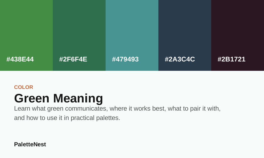
| Color | Hex | Role | Use note |
|---|---|---|---|
| Green | #438E44 | Anchor | Use for the main mood or the first repeated brand signal. |
| Green | #2F6F4E | Surface | Use for large quiet areas, reading backgrounds, or room surfaces. |
| clay | #479493 | Support | Use to connect the anchor and the accent without flattening the palette. |
| Navy Blue | #2A3C4C | Depth | Use for headings, structure, shadows, trim, or formal contrast. |
| Stone Gray | #2B1721 | Accent | Use in small repeated moments so the palette has energy without noise. |
palette role
Start by deciding whether green should be the dominant field, the supporting tone, or the accent. A dominant color controls the whole atmosphere of the page. A supporting tone appears in backgrounds, cards, borders, or secondary illustrations. An accent should be used sparingly so that it keeps visual power.
For safer first drafts, pair green with ivory and clay. Then test a deeper companion such as deep navy or a warmer companion such as warm gray. This gives the palette a readable light-to-dark range instead of a flat collection of attractive swatches.
use cases
The best layouts usually repeat the color in small, intentional moments: a heading underline, a small illustration, a navigation state, a product label, or a background wash. Repetition makes the color feel designed rather than decorative.
pairing logic
The easiest pairing test is role-based. Use one partner for clarity, one for warmth or coolness, and one for depth. Forgreen, useful companion directions include ivory, clay, deep navy, warm gray. Each companion changes the message: light neutrals make the palette quieter, dark colors make it more formal, and warm accents make it more social.
If the palette feels dull, increase temperature contrast before increasing saturation. If it feels loud, reduce the accent area before changing the hue. This keeps the original color idea intact while making the design easier to read.
search intent
Most readers do not search for green because they want a dictionary definition. They are usually trying to decide whether the color is right for a brand, room, wedding, product, illustration, article system, or interface. The page has to answer meaning first, then turn that meaning into choices about proportion, contrast, materials, and companion colors.
A strong answer separates first impression from final implementation. Green may create a useful mood, but the surrounding values decide whether that mood feels polished, childish, formal, natural, expensive, clinical, soft, or heavy. That is why this article keeps returning to roles instead of treating a single swatch as the full solution.
proportion
The safest starting point is to give green one clear level of importance. If it is the anchor, let it appear in the hero area, repeated article markers, main room surface, brand mark, or primary palette card. If it is a support color, keep it in secondary panels, borders, illustrations, textiles, or small repeated accents.
A practical first draft is one dominant surface, one text or depth color, one supporting tone, and one accent. For this page, the draft palette uses #438E44, #2F6F4E, #479493, #2A3C4C, #2B1721. Those values should not all receive equal space. The deeper values should carry structure, the softer values should carry breathing room, and the accent should stay memorable because it is used with restraint.
surface testing
A color can look convincing in a swatch and fail on the surface where it has to live. On a website, test it behind a long heading, a paragraph, a button label, a form field, and a small navigation item. In a room, test it near flooring, window light, metal, wood, fabric, and white trim. In print, test it on the actual paper stock.
This matters because green changes when the nearby values change. A warm neutral can make it feel softer. A dark companion can make it feel more serious. A saturated accent can make it feel louder. The palette is ready only when the intended meaning survives the boring production conditions, not only the mood-board version.
brand use
For a brand, green should be assigned to a repeatable job before it appears everywhere. It can identify the brand, divide content sections, mark product families, soften photography, or support editorial cards. It should not randomly alternate between background, button, text, and icon without a documented reason.
Test the color in quiet assets first: footer, invoice, email header, help text, error state, product label, and thumbnail. If green still feels appropriate in those small surfaces, it is more likely to survive real use. If it only works in a large hero mockup, keep it as a campaign accent rather than a permanent identity color.
rooms and events
In physical spaces, green is filtered through light and material. Paint, linen, ceramic, velvet, paper, foliage, flowers, glass, and metal all shift the color. A digital hex value gives a direction, but samples and photos decide whether the final scene feels calm, crisp, romantic, heavy, washed out, or dated.
Use the color on the largest surface only when the room or event can handle the mood for a long time. Otherwise, introduce it through textiles, stationery, floral elements, packaging bands, table details, signage, art, or a repeated trim color. Small repetition often feels more intentional than one oversized color decision.
pairing ladder
Build the palette in layers. First, choose the reading or resting surface. Second, choose the depth color that will carry text, trim, or structural contrast. Third, choose one companion from ivory, clay, deep navy, warm gray that changes the temperature. Fourth, add an accent only if the palette still needs energy.
If the palette feels dull, add value contrast before adding more hue. If it feels noisy, reduce accent area before replacing colors. If it feels cold, add a warmer support. If it feels too sweet, add a deeper structural color. This diagnostic ladder keeps the original color idea intact while solving practical problems.
accessibility
Do not rely on color meaning to carry information by itself. If green marks a selected state, also use text, shape, border, underline, icon, or placement. If it appears behind body copy, test the actual foreground and background contrast at the size where the text will be read.
The hardest checks are usually mobile labels, table text, image captions, navigation states, and cards with long titles. A palette that passes those small surfaces will usually handle larger editorial blocks. A palette that fails there should be simplified before more accents are added.
comparison
Compare green against at least two neighboring options before finalizing it. A cooler version may feel cleaner, a warmer version may feel more human, a darker version may feel more premium, and a lighter version may work better as a background. The comparison prevents the design from accepting the first attractive swatch too quickly.
The goal is not to find the most beautiful isolated color. The goal is to find the value that performs best beside real content. Put the candidates next to the same headline, paragraph, image, button, material, or packaging copy. The right version is often the one that makes the rest of the system easier to read.
editorial boundary
Green can suggest a direction, but it cannot decide audience fit, price point, brand promise, room lighting, accessibility, photography, or copy tone. Those decisions need separate evidence. Treat color meaning as one input in the design process, not as the final proof that a concept is right.
This boundary is especially important for search pages. Readers need useful guidance without exaggerated claims. The article should help them make a better first draft, compare related pages, test the result, and revise with confidence.
checklist
commercial use
Commercial projects often fail when a color is chosen because it is popular but not connected to a specific promise. Before using green, write down what the color should help the audience believe: calmer, more formal, more natural, more energetic, more premium, more useful, or easier to trust. That sentence should guide every companion color.
Then test distinctiveness. If the palette looks like every competitor in the category, adjust proportion, typography, photography, accent choice, or depth. A color can be familiar and still feel owned when the system around it has a clear point of view.
seasonal use
A durable system separates core colors from seasonal layers. Keep the reading surface, text depth, and main anchor stable. Let the seasonal change happen through one accent, one illustration set, one campaign band, or one related palette. This lets green stay recognizable while the surrounding story changes.
For example, a warmer companion can make the color feel autumnal, a pale companion can make it feel springlike, and a deep companion can make it feel more formal for winter or evening use. The base color does not need to change when the palette roles are well defined.
final read
The practical rule is simple: do not ask green to do every job. Let it set the tone, then let other colors handle reading, contrast, warmth, support, and emphasis. The more clearly those jobs are separated, the more sophisticated the palette will feel.
When the design feels close but not finished, return to the roles before searching for a new color. Most color problems are distribution problems: too much accent, too little depth, no quiet field, or no bridge between temperatures. Fix those problems first.
quality control
Review the palette in three passes. First, check whether the intended meaning is still obvious. Second, check whether the hierarchy is readable without relying on color alone. Third, check whether related pages, downloads, images, and small components use the same roles consistently.
If any pass fails, revise the system instead of adding more decoration. The strongest color pages make a reader feel that the advice can be used immediately, but also show enough caution that the final production decision still gets tested.
mistakes
faq
sources
Color meanings are contextual. The guidance combines common design usage, cultural boundaries, contrast needs, and palette behavior rather than claiming a universal psychological effect.
Last updated by PaletteNest Editorial Desk on 2026-06-02.