Practical guide
How to Check Focus Indicator Size and Contrast in WCAG 2.2
For WCAG 2.2 Focus Appearance, check both sufficient indicator area and a 3:1 change at the same pixels between unfocused and focused states. Then assess adjacent-color contrast separately: it compares a different pair.
Name the criterion before measuring
WCAG 2.2 Success Criterion 2.4.13, Focus Appearance, is Level AAA. It requires an area at least as large as a 2 CSS pixel thick perimeter of the unfocused component or sub-component, and at least 3:1 contrast between the same pixels in focused and unfocused states, with stated exceptions. It does not require every design to use a literal 2px outline. [1]
Success Criterion 1.4.11, Non-text Contrast, is Level AA and asks a different question about visual information necessary to identify a component or state against adjacent colors. Do not present the AAA Focus Appearance minimum as the complete AA rule for every focus outline. Visible keyboard focus and other applicable criteria also need attention. This article works the area and color comparisons; it is not a whole-page compliance assessment. [2]
Define what receives focus: a whole button, a link or a sub-component. Measure in CSS pixels, rather than screenshot device pixels on a high-density display. Use the component’s unfocused dimensions for the reference area, and inspect the actual focused result.
Calculate an ideal rectangular reference area
For an ideal rectangle of width w and height h, W3C’s explanation gives a reference area of 4w + 4h square CSS pixels. A centered 2px ring gives the same result: (w + 2)(h + 2) − (w − 2)(h − 2). For a 90 × 30 rectangle, that is 480 square CSS pixels. [1]
This is a reference-area calculation, not a command to draw that exact ring. A bottom bar or another shape can supply sufficient area if enough of it also meets the state-change contrast requirement. Rounded shapes have different geometry; inset borders, joins and clipping can change what the actual indicator supplies. A generous solid outline is often easier to review than a design positioned at a mathematical edge.
On a narrow screen, scroll this table sideways. Keyboard readers can focus the table region and use the arrow keys.
| Unfocused component | Reference area, CSS px² | Proposed solid bar | Bar area, CSS px² | Area-only result |
|---|---|---|---|---|
| 90 × 30 | 480 | 90 × 3 | 270 | Below reference |
| 160 × 44 | 816 | 160 × 3 | 480 | Below reference |
| 160 × 44 | 816 | 160 × 6 | 960 | Meets reference |
| 280 × 44 | 1296 | Fixed 160 × 6 | 960 | Below reference |
| 280 × 44 | 1296 | Scalable 280 × 6 | 1680 | Meets reference |
The reference and bar arithmetic were independently recalculated. Every row assumes an ideal rectangular component and a fully visible solid bar whose counted pixels meet the required state change. “Meets reference” describes only the area test under those assumptions, rather than a complete criterion pass.
Compare the same pixels before and after focus
For Focus Appearance’s contrast check, look at the pixels occupied by the indicator. What color were those same locations before focus, and what color are they after focus? An outline appearing outside a solid button may replace the page surface. A focused border replacing an existing border must be compared with that earlier border, rather than automatically with the nearby page. [1]
Only the portion that meets the 3:1 change counts toward the required area. A painted border that is 3px thick does not necessarily contribute all three pixels if only a 1px portion has sufficient change. A gradient, shadow or partly blended edge needs the same discipline: count qualifying area, rather than the entire painted box.
Keep this check distinct from the text contrast inside the control. Changing a button’s whole fill can create a strong state change, but the label must remain readable and the focused state must be recognizable. W3C’s discussion warns that a whole-fill change can be harder to identify in some contexts, such as an isolated component viewed with magnification. A clearly visible outline is a useful design starting point. [1]
Check adjacent contrast as a separate comparison
Now ask what touches the focused visual cue. An outer ring may need contrast with the outer surface; an inner ring may need contrast with the component fill. The necessary visual information is assessed against its adjacent colors under Non-text Contrast. Passing the same-pixel state-change check does not automatically pass this adjacent comparison, or vice versa. [1] [2]
On a narrow screen, scroll this table sideways. Keyboard readers can focus the table region and use the arrow keys.
| Focused indicator | Before/after pair | State-change ratio | Indicator/adjacent white | Adjacent ratio |
|---|---|---|---|---|
| #555555 | Black → #555555 | 2.816834:1 — below 3 | #555555 / #FFFFFF | 7.455178:1 — meets 3 |
| #AAAAAA | Black → #AAAAAA | 9.039556:1 — meets 3 | #AAAAAA / #FFFFFF | 2.323123:1 — below 3 |
These authored opaque-sRGB examples assume adequate indicator area and the stated white adjacent surface. Their ratios were independently checked with high-precision arithmetic. They demonstrate how two color tests can disagree; neither row establishes complete component conformance.
Scroll the labelled diagram sideways on a phone; the labels keep their readable size.
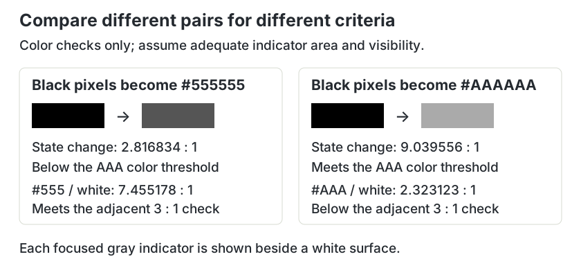
The ratios use WCAG relative luminance and the contrast formula (Llighter + 0.05) / (Ldarker + 0.05), with unrounded decisions. They exclude transparency, wide-gamut colors and image sampling. [3]
Read the browser-indicator exceptions narrowly
Focus Appearance includes an exception when the user agent determines the indicator and the author cannot adjust it. Another applies when both the focus indicator and its background color are not modified by the author. “It is the browser default” is therefore not a sufficient description of every case. [1]
Changing the surface behind a default indicator can remove the second exception and can reduce visibility. W3C’s explanation discusses background changes, including a component background behind a browser’s inner indicator. Inspect the actual browser behavior after your styles are applied. Do not infer an exception simply because your stylesheet lacks an explicit outline color.
Document which exception, if any, you are relying on and why. If you can author the indicator, a clear visible treatment with ample area and robust colors is generally easier to maintain than assumptions about a default that varies by browser.
Test resizing, backgrounds and the complete focused state
Start with a controlled surface and a visible solid indicator. For example, a navy #17345C outline appearing on an off-white #F6F7F4 field has a calculated ratio of 11.609532:1. If those same locations were off-white before focus, that pair supports the state-change color check as well. The area and visibility still require rendered inspection.
/* Example requires the stated solid outer surface. */
.control:focus-visible {
  outline: 3px solid #17345C;
  outline-offset: 2px;
}
Focus the control using the keyboard. Inspect it at supported phone and desktop widths, with longer labels and at browser zoom. A fixed 160px bar that was sufficient for a small button can become insufficient after the button grows. Check whether overflow clips the ring and whether surrounding content hides it. Those observations matter to a usable result; this article does not claim to evaluate every obstruction criterion.
Save the unfocused dimensions, reference calculation, qualifying indicator area, before/after colors and adjacent colors. For photographs or varied backgrounds, a calculation from one convenient sample is insufficient. Prefer a controlled surface or a carefully designed indicator whose actual combinations can be checked. Our button pair guide keeps label and boundary roles separate, while the selected-tab guide distinguishes selected state from current keyboard focus.
Try three original focus reviews
These fictional cases isolate a measurement decision. They are not reports of tested client interfaces.
Case 1
A 160 × 44 button uses a fully qualifying 160 × 6 bottom bar. A longer label makes the button 280 × 44, but the bar stays 160 × 6. Does the old area result remain valid?
Show answer and explanation for case 1
No. The fixed bar’s 960 CSS px² is below the new rectangular reference of 1296 CSS px².
The original reference was 816, so 960 met the area-only comparison. After resizing, 4 × 280 + 4 × 44 = 1296. A 280 × 6 bar would provide 1680 under the same fully-visible, qualifying-pixel assumptions. Recheck actual geometry and other requirements rather than carrying forward the small-button result.
Case 2
A sufficiently large #AAAAAA focus border replaces black border pixels beside white. The state-change ratio is 9.039556:1. Does that settle adjacent Non-text Contrast?
Show answer and explanation for case 2
No. Its adjacent-white ratio is only 2.323123:1.
The first pair compares focused pixels with their previous black color. The second compares the necessary focused cue with the white surface next to it. Passing the first color comparison does not make the second comparison pass; redesign the cue or its surrounding surface and recheck.
Case 3
An author draws a 3px focus border, but only 1px of its thickness has a 3:1 change from the unfocused pixels. Can the entire painted border area be counted?
Show answer and explanation for case 3
No. Count only the portion with sufficient same-pixel state-change contrast.
The literal CSS border width is not the qualifying area. Calculate or measure the area of the contrasting portion and compare it with the reference minimum. The non-qualifying part may still be visible decoration, but it does not supply this criterion’s required contrasting area.
Sources and further reading
- W3C: Understanding SC 2.4.13, Focus AppearanceCriterion and Level AAA label, intent, minimum area, change of contrast, relationship to Non-text Contrast and exceptions; supports the reference geometry and separate comparisons.
- W3C: Understanding SC 1.4.11, Non-text ContrastCriterion and Level AA label, intent, component examples and testing principles; supports necessary state cues against adjacent colors.
- W3C: Contrast and luminance definitions in Understanding Contrast (Minimum)Complete contrast ratio and relative luminance definitions; calculation basis for the authored opaque-sRGB pairs.