Practical guide
How to Show a Selected Tab Without Color Alone
Separate the selected panel from keyboard focus. Use a visible non-color selection cue, readable labels, adjacent contrast checks and the appropriate tab interaction pattern.
Show the selected panel and current focus as different facts
Give the selected tab a visible cue beyond hue, and keep keyboard focus separately identifiable. For example, a persistent bar or outline can mark the selected tab while a distinct focus outline locates the tab currently reached by the keyboard.
Those facts can coincide, but they are not always the same. In a manually activated tab set, moving keyboard focus to another tab does not immediately switch the displayed panel. The reader needs to know both which content is selected and which control an activation key will operate.
The examples here are original state plans, not a working widget or a claim that a production implementation has passed testing. WAI-ARIA’s tab pattern supplies interaction guidance; WCAG supplies relevant requirements. Use both at their proper scope.
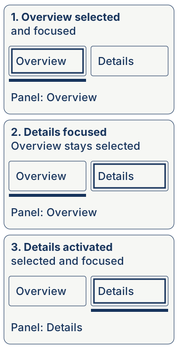
A manual tab set can have three visible situations
| Visible situation | Panel | Cue to preserve |
|---|---|---|
| Overview selected and focused. | Overview remains displayed. | Overview selection cue plus its focus cue. |
| Overview selected; Details focused. | Overview remains displayed before activation. | Overview selection cue and a separate focus cue on Details. |
| Details activated and focused. | Details is now displayed. | Move the selection cue to Details; keep focus visible there. |
A single cyan fill reused for both “selected” and “focused” can make the second row ambiguous. Avoid solving this merely with two slightly different cyan values. Use a visible structural cue that remains attached to the selected tab and an independently visible focus indication.
The APG manual example illustrates this distinction with different border treatments and a focus treatment inside the tab. Its exact pixel sizes are example design choices, not a rule requiring every tab widget to copy those sizes.
Check the cyan label, the surface and the state cue separately
The current startup palette contains cyan #20B7D8, navy #17345C and off white #F6F7F4. Cyan against that off white gives 2.212594:1, below ordinary-text contrast and below 3:1 if that cyan mark is the necessary visible cue against the off-white surface.
Navy against off white gives 11.609532:1. An original application can use navy labels and a navy selected bar on the off-white surface, while reserving cyan for a suitable decorative or separately checked role.
| Pair | Ratio | What the number supports |
|---|---|---|
| Cyan #20B7D8 / off white #F6F7F4 | 2.212594:1 | Not suitable for ordinary tab text; insufficient for a needed 3:1 cue on this surface. |
| Navy #17345C / off white #F6F7F4 | 11.609532:1 | Meets text contrast and the numeric 3:1 comparison for the proposed cue on this adjacent surface. |
The numeric comparison alone does not prove that a bar communicates selection or that focus is distinct. Check the shape, position, visible labeling and actual interaction. A bar hidden below a clipped tab list is not rescued by its high contrast.
Do not invent a selected-versus-unselected color threshold
WCAG 1.4.11 concerns visual information needed to identify components and states against adjacent colors. Its Understanding guidance says it does not require 3:1 between separate states that do not appear next to one another, such as default and hover colors.
For your selected bar, identify the surface immediately around it. For the focus outline, identify the surfaces beside that outline in the actual component. For each label, identify the background behind its text. These are different comparisons.
This is also separate from WCAG 1.4.1’s use-of-color question. A mathematically sufficient boundary does not automatically give a reader the semantic meaning “this panel is selected.” Provide a suitable visible cue and enough context for that meaning.
Do not apply 3:1 to every decorative divider or every pair of palette swatches. Name the visual information that is actually needed to understand or operate the tab set before deciding which comparison matters.
Follow the chosen interaction pattern deliberately
In the APG manual-activation pattern, arrow keys move among tabs and Space or Enter activates the focused tab. The active tab’s aria-selected state is true and the others are false. Tabs, the tab list and panels have their corresponding roles and relationships.
Automatic activation is a different choice. APG recommends it when displaying the panel does not introduce noticeable latency, typically because the panel content is already available. Do not switch content slowly on every arrow-key move without considering that guidance.
Do not add tab roles to a row of ordinary navigation links unless you are implementing the corresponding tab behavior. A set of links opening separate pages has a different interaction job from controls switching panels in one tab set.
APG is implementation guidance, not a substitute for testing. Its example warns that browser and assistive-technology combinations may have support gaps and should be tested before production use. This article does not claim those tests have been performed.
Run a short state sequence on desktop and phone
- Locate the selected tab without relying on a particular hue.
- Reach the tab set with the keyboard and identify current focus.
- For manual activation, move focus to another tab while confirming that selection stays on the old panel.
- Activate the new tab and confirm that the selected cue, exposed state and panel change together.
- Inspect every required text and cue against its real adjacent surface.
- Check long labels, zoom and the phone layout for clipped cues or hidden focused tabs.
Keep the selection cue understandable when tabs wrap or scroll. A cropped bottom border or an off-screen focused tab defeats the visual plan. Choose a layout that exposes the active information at the intended viewport rather than relying on the wide desktop mockup.
Record actual implementation results separately from this article’s source and calculation evidence. Use the startup brand palette for the surrounding product roles, and the chart examples when the question concerns data-series identification rather than a tab control.
Sources and further reading
- Understanding Success Criterion 1.4.1: Use of Color | WAI | W3CSelection meaning should not depend only on recognizing hue.
- Understanding Success Criterion 1.4.3: Contrast (Minimum) | WAI | W3CTab labels need the applicable text/background contrast.
- Understanding Success Criterion 1.4.11: Non-text Contrast | WAI | W3CRequired state cues versus adjacent colors; no universal 3:1 requirement between separate nonadjacent states.
- Understanding Success Criterion 2.4.7: Focus Visible | WAI | W3CKeyboard focus must be visible in an operative mode.
- Tabs Pattern | APG | WAI | W3CInformative tab pattern: manual and automatic activation, roles, states and keyboard guidance.
- Example of Tabs with Manual Activation | APG | WAI | W3CManual-activation example deliberately distinguishes persistent selection from keyboard focus; production requires testing, not blind copying.