Practical guide
Button Contrast: Check Labels, Boundaries and States Separately
Check the label against its fill first. Then check any visual cue needed to identify the control or its state against the colors next to that cue. Those checks use different thresholds and can give different answers.
Start with three named color roles
“Is this button accessible?” is too broad for a color calculator. Write down the exact foreground and background of the label, the outer surface beside the control, and the visual information that tells a reader it is a control. A readable label, a visible boundary and a recognizable selected state are separate questions. Checking one pair cannot settle all three.
For ordinary text, WCAG 2.2 Success Criterion 1.4.3, Contrast (Minimum), sets a 4.5:1 minimum. Its large-text threshold is 3:1. Success Criterion 1.4.11, Non-text Contrast, requires 3:1 against adjacent colors for visual information necessary to identify a user interface component or its state, subject to its exceptions. Both criteria are Level AA. [1] [2]
Use the colors actually delivered in each state. A translucent overlay, background photograph or different theme changes the problem. The worked pairs here assume opaque, 8-bit sRGB colors. They demonstrate a calculation method, rather than certify a complete widget.
Check label text against the actual fill
A button caption such as “Book a session” is functional text. Using a brand palette does not turn that caption into an exempt logo. Compare the specified text color with the surface behind the letters, including a changed fill in a hover or focus state. Do not compare the text with the page background when a solid button fill is actually behind it. [1]
Large text means at least 18 points regular or 14 points bold, or the equivalent size for the relevant script. With the usual CSS conversion, those are 24 CSS pixels regular or about 18.67 CSS pixels bold. A 16px bold label remains ordinary-size text. A heading tag, enlarged screenshot or browser zoom does not by itself qualify the original text as large.
Retain the unrounded ratio when deciding whether a threshold is met. The neutral example #777777 on white is 4.478089:1: it meets 3:1 but falls short of 4.5:1. Rounding a displayed value to “4.5” would conceal that failure for a 16px label. Even a nominal numerical pass can be difficult to read with a very thin font, so inspect the delivered typography as well. [1]
Work six distinct pair decisions
On a narrow screen, scroll this table sideways. Keyboard readers can focus the table region and use the arrow keys.
| Role and pair | Ratio | Applicable check | Result for the stated role |
|---|---|---|---|
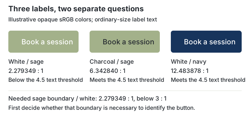
| Ordinary label: #FFFFFF on #A3B18A | 2.279349:1 | Text, 4.5:1 | Below threshold |
| Ordinary label: #252A30 on #A3B18A | 6.342840:1 | Text, 4.5:1 | Meets this text check |
| Ordinary label: #FFFFFF on #17345C | 12.483878:1 | Text, 4.5:1 | Meets this text check |
| Needed boundary: #A3B18A against #FFFFFF | 2.279349:1 | Non-text, 3:1 | Below threshold if boundary is necessary |
| Needed state cue: #20B7D8 against #F6F7F4 | 2.212594:1 | Non-text, 3:1 | Below threshold for that necessary cue |
| Ordinary 16px label: #777777 on #FFFFFF | 4.478089:1 | Text, 4.5:1 | Below threshold before rounding |
The sage, charcoal, navy and off-white roles build on our website background palette guide; cyan is a separate state-cue example. Gray #777777 is an authored neutral example, not a claimed existing brand swatch. Ratios were calculated from the WCAG sRGB relative-luminance formula and independently checked with higher-precision arithmetic. Decisions use unrounded values. [1]
Scroll the labelled diagram sideways on a phone; the labels keep their readable size.
Decide whether the boundary is necessary
A faint fill is not automatically a Non-text Contrast failure. WCAG’s explanation gives examples in which a text label itself supplies the information needed to identify a button; an additional outline or fill is not always necessary. Ask what identifies this particular control in context. If the reader must distinguish an input area from its surroundings using its boundary, that boundary has a different job from decorative shading. [2]
Write the necessity decision beside the pair record. For example: “The visible outline is needed to locate the editable field; compare it with the surrounding white surface.” That statement makes a 2.279349:1 sage boundary a problem under the stated assumption. By contrast, saying “All button edges must be 3:1” would apply the criterion too broadly.
States also need their own analysis. A checkbox check mark needed to show selection must contrast with the fill next to the mark. A selected tab’s indicator needs a recognizable relationship to its adjacent surface. Hue alone must not be the sole means of conveying information; a text label, shape or other meaningful cue may be needed. Our selected-tab guide covers selection and keyboard focus as distinct interactions. [2] [3]
Recheck states without inventing a hover rule
Normal and hover colors do not have to contrast with each other by 3:1 merely because they are two states. They are not necessarily adjacent colors. Check the information necessary to identify the component or state against the colors actually next to it in each state. A subtle extra hover decoration may be supplementary; it must not destroy the contrast of a cue the control still needs. [2]
A focus outline adds another pair. An outside ring is compared with the surface beside that ring; an inside indicator may be compared with the component fill. Keyboard focus also has requirements beyond this article’s button pairs. Use the focus size and state-change guide when assessing WCAG 2.2’s Level AAA Focus Appearance criterion.
The inactive-component exceptions are narrow. Do not lower every low-priority control’s contrast or treat a read-only value as disabled just because it cannot be edited. Our disabled and read-only guide addresses that separate distinction. Preserve readable instructions and meaningful values rather than applying an exception by visual appearance alone. [1] [2]
Keep a pair record beside the CSS
Record the role, exact colors, actual font size and weight, relevant state, threshold and unrounded result. Include the reason a boundary or state cue is necessary. This is more useful than a single “palette passes” badge because a future theme or component change tells you which pair to revisit.
.action {
  background: #17345C;
  color: #FFFFFF;
  font-size: 16px;
}
/* Example assumes a controlled #F6F7F4 outer surface. */
.action:focus-visible {
  outline: 3px solid #17345C;
  outline-offset: 2px;
}
In this example, the white label/navy fill ratio is 12.483878:1. Navy against the assumed off-white surface is 11.609532:1. These calculations support the named pairs; the snippet does not establish focus visibility, area, clipping, keyboard operation or a complete component audit. Test the actual control, including browser zoom and all supported states.
Useful handoff: “Ordinary 16px label; white on navy; 4.5:1 text threshold; 12.483877… unrounded. Outer focus ring on controlled off-white; 3:1 adjacent-color check; 11.609532… . Check rendered ring geometry and visibility separately.”
Try three original design decisions
These are fictional decisions for practice. Each answer identifies the assumption that changes the outcome.
Case 1
A charcoal label sits on a pale sage button fill. The label and context already identify the action. Must the sage fill contrast with the white page by 3:1 in every case?
Show answer and explanation for case 1
Not automatically. First decide whether the fill or boundary is necessary to identify this control.
Charcoal/sage meets the stated ordinary-text check at 6.342840:1. Sage/white is only 2.279349:1, which matters if that boundary is needed. Non-text Contrast does not universally require a decorative button background to meet 3:1. Record and inspect the identification decision in context.
Case 2
A designer says the normal navy fill and a slightly different hover fill must be 3:1 apart. Is that the universal WCAG rule?
Show answer and explanation for case 2
No. Check the needed visual information against its own adjacent colors in each state.
Normal and hover appearances are not automatically adjacent. The label still needs text contrast against the hover fill, and a necessary state indicator still needs adjacent contrast. An optional hover effect does not create a blanket 3:1 comparison between the two complete states.
Case 3
A 16px bold gray #777777 label on white displays as “4.5” in a one-decimal calculator. Can it use the large-text exception or claim a 4.5:1 pass?
Show answer and explanation for case 3
Neither conclusion follows. It is ordinary-size text, and its unrounded ratio is below 4.5:1.
16px bold is below the large-text size threshold. The calculated ratio is 4.478089453…:1, so rounding cannot turn it into a pass. Choose a darker color, change the delivered typography enough to qualify legitimately, or otherwise revise the design and recalculate.
Sources and further reading
- W3C: Understanding SC 1.4.3, Contrast (Minimum)Criterion, intent, formula notes and complete contrast ratio, relative luminance and large-scale definitions; supports text pairs and unrounded thresholds.
- W3C: Understanding SC 1.4.11, Non-text ContrastCriterion, intent, user interface component examples and testing principles; supports necessary versus decorative cues and adjacent-color state checks.
- W3C: Understanding SC 1.4.1, Use of ColorCriterion and intent; supports meaningful cues beyond color alone.