Practical guide
How to Make Inline Links Identifiable Without Color Alone
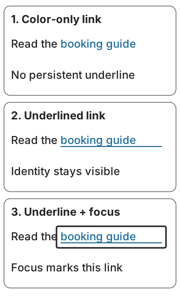
Separate link-to-background contrast from link identification. Compare a blue link with dark body text, use a persistent underline, and check keyboard focus separately.
Use an underline that is visible before interaction
For an inline link in a paragraph, a persistent underline is a practical starting pattern. It makes the link identifiable without asking the reader to recognize its hue. Then check the link text against its actual background and provide a visible keyboard-focus indicator.
Those are separate jobs. A link can be dark enough to read on white but look too similar to the surrounding paragraph to identify by color alone. A link can also be underlined and still use unreadable text, or have no visible focus when reached with the keyboard.
The examples below are original solid, opaque sRGB calculations, not measurements of a live client website. The recorded ratios do not establish complete WCAG conformance. They help you decide which pair and which visible cue need attention.
Write down three different checks
| Question | Comparison or cue | Practical action |
|---|---|---|
| Can the words be read? | Link foreground against its actual background. | Check the ordinary-text 4.5:1 requirement where applicable. |
| Can the link be identified? | Persistent underline, another suitable visible cue, or a justified lightness-only pattern. | Keep the cue visible before hover or focus. |
| Where is keyboard focus? | The focused component’s visible indication. | Reach it with the keyboard and inspect the indicator on that surface. |
Do not replace the first row with a comparison between blue and black. The body color is not the background behind the link. Do not replace the third row with an underline that is identical on every link: that tells you which words are links, but it does not locate the currently focused link.
A blue link can pass one comparison and fail another
Use this original example: ordinary paragraph text is #222222, the inline link is #176B99, and the background is #FFFFFF. All colors are fully opaque.
| Pair | Calculated ratio | What it answers |
|---|---|---|
| Link #176B99 / white #FFFFFF | 5.834158:1 | Meets 4.5:1 for ordinary text on this background. |
| Body #222222 / white #FFFFFF | 15.909984:1 | Meets 4.5:1 for the paragraph. |
| Link #176B99 / body #222222 | 2.727040:1 | Does not supply the 3:1 lightness difference used by G183’s color-identified link technique. |
If these inline links are identified only by their color/lightness difference, that third result is the unresolved identification check. Adding a persistent underline gives another visible means of identifying them. It does not change any of the ratios.
With the underline present, you do not need to darken or lighten this blue merely to achieve 3:1 against the paragraph under that color-only technique. You still need the applicable link-to-background text contrast and a visible focus presentation. Record the underline in the component rule so a later stylesheet does not silently remove it.
Read the current G183 technique as a sufficient route
W3C’s G183 technique explains a route for links whose identification depends on the lightness difference from surrounding static text. It uses at least 3:1 between those text colors. Both colors also need sufficient contrast with the background for their text use.
The version checked for this guide was updated on 27 July 2026. It recommends an additional cue such as underlining or bolding as a usability improvement, but its test does not make a separate hover-or-focus cue a mandatory condition of G183. Avoid copying an older shorthand checklist and presenting it as the current wording.
A sufficient technique is guidance describing one way to meet a criterion; it is not the only permitted design. A persistent underline is useful because the reader can identify the link without first hovering, focusing or recognizing a particular hue. It is also easy to document and preserve across templates.
If your design depends on a special non-underlined treatment, write down the evidence for that treatment rather than assuming that a blue hex code is enough. Inspect the paragraph at its actual size, including any different background used in a card or callout.
Keep link identity and keyboard focus separate
Tab through the implemented page. There should be a visible indication of which operable component currently has keyboard focus. WCAG 2.4.7 requires a visible focus mode for keyboard-operable interfaces; it does not prescribe one universal outline thickness or color.
If you design a non-text outline or border needed to identify focus, assess its actual adjacent colors under the relevant non-text-contrast guidance. Comparing the default blue with a different focus blue does not answer whether an outline can be seen against the surface immediately beside it.
A persistent underline may stay in every state. The focused link can add a clearly visible outline or another appropriate indicator. Check that long links wrapping onto two lines remain identifiable, and that the indicator is not hidden by a clipping container.
This guide supplies the review questions, not a tested production stylesheet. Inspect the real component with keyboard navigation, zoom and its intended desktop and phone layout before documenting its status.
Save a small link rule rather than a single hex value
- Paragraph text and background: record the exact pair.
- Inline link text and background: record that pair and the applicable threshold decision.
- Identification: state “persistent underline” or the justified alternative.
- Focus: record what changes and where it was inspected with keyboard navigation.
- Other surfaces: check cards, banners and dark themes separately.
Keep decisions based on the unrounded calculation. Rounded display values help readers compare examples but must not turn a below-threshold value into a pass.
Use the one-page usage record to document the roles, and the startup palette guide for a real five-swatch application. If your link text is transparent, first resolve its composite color with the transparent-text calculation guide; this opaque example does not model that case.
Sources and further reading
- Understanding Success Criterion 1.4.1: Use of Color | WAI | W3CSC 1.4.1: visible information beyond color; lightness distinction can sometimes be a cue.
- G183: Using a contrast ratio of at least 3:1 to distinguish inline text links from surrounding text | WAI | W3CCurrent sufficient technique updated 27 July 2026: 3:1 lightness contrast between color-identified links and static text; optional additional cues, not a mandatory hover/focus condition.
- Understanding Success Criterion 1.4.3: Contrast (Minimum) | WAI | W3CSC 1.4.3 text/background contrast and unrounded thresholds.
- Understanding Success Criterion 2.4.7: Focus Visible | WAI | W3CSC 2.4.7 keyboard focus must be visible; its form is not specified by this criterion.
- Understanding Success Criterion 1.4.11: Non-text Contrast | WAI | W3CNeeded non-text focus cues and adjacent-color contrast, distinct from comparing separate states.