Practical guide
How to Check Text Contrast on a Two-Stop CSS Gradient
Check the background colors under the actual text, not only the two gradient stops. A two-stop gradient can meet an ordinary-text threshold at both endpoints and still fail in the middle. Record the interpolation space and the limits of any sampling.
Locate the text before choosing background samples
A gradient gives the same line of text several potential backgrounds. Start by naming the text element, its foreground color, actual font size and weight, visible state, and the area it occupies on the gradient. A color at an unused corner does not describe the background under a letter. An average of the whole banner can hide a difficult part of the reading surface.
WCAG 2.2 Contrast (Minimum), Success Criterion 1.4.3 at Level AA, generally requires 4.5:1 for ordinary text or 3:1 for qualifying large text, with its defined exceptions. For this article’s counterexample, assume ordinary 16px black text. Keep decisions unrounded; the displayed ratios are only convenient summaries. [1]
Review the actual colors specified behind the text, rather than sampling a partially anti-aliased letter edge and treating that as the author’s foreground. A nominal contrast check is one part of readable typography and does not establish a complete accessibility result. Here we work one opaque two-stop sRGB case, then identify when that model no longer fits. [1]
Record stops, direction and interpolation space
A CSS gradient is an image generated along a gradient line. Its direction, stop positions, hints and concrete background size determine where each color falls. It belongs in an image-valued property such as background-image, rather than background-color. Resizing the surface can change which part of that image sits behind a particular line of text. [2]
Record the interpolation space as well as the endpoint hex values. Current MDN documentation describes Oklab as the default interpolation space and provides an explicit in syntax to choose another space. Its latest-syntax notes also warn that not every browser implements every part. Check your supported browsers and the actual declaration they accept, rather than treating every gradient as encoded-RGB averaging. [2] [3]
/* Counterexample to endpoint-only checks, not an approved text surface. */
background-image: linear-gradient(
  to right in srgb,
  #FF0000 0%,
  #00A600 100%
);
color: #000000;
font-size: 16px;
For the next table, assume that exact two-stop, opaque gradient, no color hint, no additional layer and a horizontal gradient line. A position of 50% means the midpoint of the specified transition. The table does not infer where your real text lies on an arbitrary rotated, cropped or layered background.
Reproduce an endpoint-passing, interior-failing example
In the specified encoded-sRGB interpolation, red runs from 255 to 0 while green runs from 0 to 166. At the midpoint, the nominal channels are 127.5, 83 and 0. Preserve those fractions when converting to linear sRGB for WCAG relative luminance; a rounded hex approximation describes a slightly different color. [1] [3]
Scroll sideways on a phone. Keyboard readers can focus the table region and use the arrow keys.
| Position | Encoded R, G, B (0–255) | Black-text ratio | Ordinary-text color check |
|---|---|---|---|
| 0% | 255, 0, 0 | 5.252000:1 | Meets 4.5 |
| 25% | 191.25, 41.5, 0 | 3.545898:1 | Below 4.5 |
| 50% | 127.5, 83, 0 | 3.147406:1 | Below 4.5 |
| 75% | 63.75, 124.5, 0 | 4.124515:1 | Below 4.5 |
| 100% | 0, 166, 0 | 6.454487:1 | Meets 4.5 |
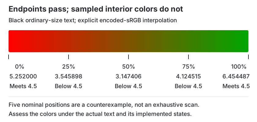
Both endpoints meet the stated threshold, while three sampled interior positions do not. Interpolating the encoded channel values and then applying the nonlinear luminance conversion can produce an interior result that the endpoint checks miss. The float calculations were independently verified using higher-precision decimal arithmetic, exact coefficients and unrounded classifications.
The labelled diagram keeps its readable size; scroll it sideways on a phone.
Use sampling to find failures, not to invent certainty
A failed relevant sample is useful evidence for a revision. Passing a few samples is a weaker result: it does not prove that every color under every letter meets the threshold. The five positions above demonstrate a counterexample; they are not a universal sampling grid, an exact minimum search or a certificate for a whole gradient.
Relate samples to the real text footprint. If text can wrap or move as the container resizes, inspect its background at those layouts too. A short caption at the left edge and a long headline crossing the middle need different location records even when they share the same gradient declaration.
Do not transfer these values to another interpolation space, transparent stop or blend mode. The transparent-text guide handles one narrow source-over case on a solid opaque background; it explicitly excludes gradients and more complex layers. Identify the actual compositing context before applying a simple calculator to a different presentation.
Give difficult text a controlled reading surface
One practical remedy is to put the text on a suitable opaque surface, while leaving the gradient as surrounding decoration. For example, opaque black text on an opaque white panel has a 21:1 nominal pair. The panel must actually cover the area behind the text; a partly transparent panel does not automatically supply that white background. [1]
.reading-panel {
  background-color: #FFFFFF;
  color: #000000;
  padding: 1rem;
}
This example supports a named color pair, rather than a complete layout approval. Inspect text size, wrapping, margins, focus treatments for any controls and all visible states. A panel clipped away from part of the text, an inherited opacity or an overlay changes the actual context.
You can also revise the gradient or move the text, but recheck the result rather than relying on a palette name. Choosing a different interpolation space changes the transition itself; that design choice needs its own verification. For more general page surfaces, use the website background guide.
Keep a reproducible audit record
Save the exact declaration, text style, gradient size and direction, stop positions, interpolation space and layer context. Record which colors or positions were checked beneath the text, the unrounded lowest result found, applicable threshold, and what your method has not covered. A record that says “five samples checked; other positions unresolved” is more useful than a broad approval badge.
After a revision, record the actual implemented state and supported layouts again. A new campaign headline, longer translated copy or a moved control can change the footprint. Keep this specific review alongside your brand color usage record; its solid-pair calculations do not automatically cover a new gradient.
Download a blank gradient-text review record
The plain-text record is editable and contains no prefilled client result. Use “pending” for unresolved sampling, compositing or implementation checks. Keep the scope narrow enough that another reviewer can reproduce the numbers and understand the remaining work.
Try three original review decisions
These fictional cases concern a proposed design and a recorded method, rather than an observed client audit.
Case 1
A 16px black headline crosses the middle of the specified red-to-green encoded-sRGB gradient. Its author checked only the endpoint ratios 5.252 and 6.454487. Is that enough?
Show answer and explanation for case 1
No. A relevant midpoint sample gives 3.147406:1, below the ordinary-text threshold.
The endpoint calculations miss interior colors. Because the stated headline crosses the middle, that background is relevant to its text footprint. Revise the reading surface or the design and recheck; the five-position table is a counterexample, not an exhaustive audit of another gradient.
Case 2
Five samples under a proposed gradient label all meet 4.5:1. Can the record state that every position and layout is approved?
Show answer and explanation for case 2
No. Report the five checks and their limits.
A finite set of passing samples does not establish every intervening color or a changed text footprint. Record the method, inspect the actual supported layouts and resolve the remaining range or compositing problem. An opaque reading surface can make the underlying pair much easier to define.
Case 3
A headline is moved onto a white panel, but the parent of the panel has reduced opacity. Can its author reuse the opaque black/white 21:1 result unchanged?
Show answer and explanation for case 3
No. The group opacity changes the actual compositing context.
The 21:1 pair assumes opaque black text and an opaque white surface. Parent opacity can affect the panel and its descendants together. Identify the backdrop and layers, or revise the design to preserve the intended opaque reading surface, before calculating and recording the real pair.
Sources and further reading
- W3C: Understanding SC 1.4.3, Contrast (Minimum)Previously read criterion, intent, formula notes and complete contrast/luminance/large-text definitions; supports thresholds, unrounded decisions and the nominal sRGB calculations.
- MDN: linear-gradient() CSS functionCurrent main text: gradient line, directions, stop positions, hints, image-valued use, explicit interpolation syntax and implementation caveat. Embedded examples were not run.
- MDN: <color-interpolation-method> CSS typeCurrent main text: interpolation-space role, current Oklab default description and explicit srgb choice; no browser-compatibility test or underlying-spec reading claimed.