Practical guide
Error, Warning and Success Colors: Keep the Message Clear in Words
Start with the actual message and next step, then choose a readable text/background pair. A red, yellow or green tint can support the design, but readers should understand the state without needing to identify its hue.
Write what happened before choosing a color
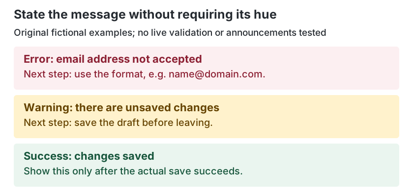
A message has a job before it has a swatch. An error tells the reader what was not accepted; a warning names a condition requiring attention; a success confirms a completed action. Write those facts in words. Color alone must not be the only way to convey the information, action or response. [2]
The examples here use product-assigned roles, rather than claim that a hue has one universal meaning. Labels and useful wording keep the distinction available when a reader cannot distinguish the colors, when a theme changes or when the message is copied into another context.
Keep success wording tied to the actual event. “Changes saved” is suitable only after the save succeeds. While an action is still pending, a message describing the waiting state is a different fact. These are original fictional content examples; no real service transaction or notification behavior has been tested.
Give each state a clear message and next step
Scroll sideways on a phone. Keyboard readers can focus the table region and use the arrow keys.
| Role | Visible message example | Useful next step or condition | What color alone cannot explain |
|---|---|---|---|
| Error | Email address not accepted. | Use the required format, for example name@domain.com. | Which item failed and why. |
| Warning | There are unsaved changes. | Save the draft before leaving, if that is the intended workflow. | What is at risk and what to do next. |
| Success | Changes saved. | Confirm only after the actual save succeeds. | Whether the action really completed. |
| Information | Export is being prepared. | Wait or use the product’s actual available next action. | What is happening now. |
Use the product’s real validation rules and available actions. An invented format or a generic “Something went wrong” can leave the user with an attractive but unhelpful banner. For an automatically detected input error, WCAG 3.3.1 requires the affected item to be identified and the error described in text. [3]
Keep a field label and persistent instruction separate from its error message. A placeholder that disappears after entry cannot hold the only recovery instruction. The placeholder and form-hint guide covers those field-information roles; this page supplies the message-state plan.
Check text on each message’s actual surface
For ordinary text, WCAG 1.4.3’s Level AA minimum is generally 4.5:1, with its specified exceptions. A small message does not gain an exemption by being secondary, temporary-looking or tinted. Qualifying large text has a different threshold, but a 16px bold message remains ordinary-size text. [1]
Scroll sideways on a phone. Keyboard readers can focus the table region and use the arrow keys.
| Role | Text foreground | Actual surface | Calculated ratio | Color-pair result |
|---|---|---|---|---|
| Error | #8C2033 | #FCEFF1 | 7.915544:1 | Meets 4.5 |
| Warning | #654300 | #FFF2CC | 7.989458:1 | Meets 4.5 |
| Success | #16553B | #EAF5EF | 7.846664:1 | Meets 4.5 |
| Information | #17345C | #F0F4FA | 11.310246:1 | Meets 4.5 |
These authored pairs were calculated with the WCAG relative-luminance formula and independently checked using high-precision decimal arithmetic. Decisions use unrounded results. They provide reproducible starting pairs for the stated opaque surfaces, rather than a tested notification system or a guarantee for another background.
The labelled diagram keeps its readable size; scroll it sideways on a phone.
Keep icon and boundary checks separate
A readable message does not prove every visual cue around it is distinguishable. Non-text Contrast, WCAG 1.4.11 at Level AA, addresses visual information necessary to identify components, their states and meaningful graphics against adjacent colors, generally at 3:1 with its exceptions. Decide which cue is needed and what color sits next to it. [6]
An icon can reinforce a message, but it must not leave hue as the only meaning. If an icon is necessary visual information, check that icon’s relevant adjacent pair. Do not assume a decorative outline is necessary just because it surrounds a pale panel, or assume that a sufficiently dark outline proves the small words inside are readable.
A form’s error border has a different role from the error text below it. Check their actual surfaces separately, including focus and any other relevant state. The button and state-pair guide explains why label and needed-boundary comparisons answer distinct questions.
Separate identifying an error from helping repair it
“Email is not valid” identifies the item and problem; more specific wording can also explain a correction. WCAG 3.3.3, Error Suggestion at Level AA, asks for known correction suggestions when an input error is automatically detected, unless providing them would jeopardize the security or purpose of the content. Use the actual allowed format or rule when it can appropriately be provided. [3] [4]
For a fictional product that expects an email address, wording such as “Email address not accepted. Enter an address in the format name@domain.com” gives an explicit format suggestion; it is a content example, not a validation algorithm. Replace that instruction with the real service’s useful and permitted guidance. Color cannot communicate which item failed, what was accepted or how to correct the data.
The identification criterion does not mandate one universal display location. Its explanation allows approaches such as inline messages, an error list or an alert depending on the situation. Choose a presentation that lets the user find the affected item and retain the information needed to repair it; do not turn a color-token specification into a claim that all form relationships and behavior are complete. [3]
Review dynamic status and keep the handoff honest
Readable words on a screen are not automatically an accessible announcement. WCAG 4.1.3, Status Messages at Level AA, concerns status messages that can be programmatically determined through roles or properties so assistive technologies can present them without receiving focus. Its scope includes information about results, waiting, progress or errors when it does not involve a change of context. [5]
A brief “Searching…” or “No results returned” message can fall within that scope when inserted without taking focus or refreshing the page. The result list itself is not the same status update. Messages involving a context change require their own analysis; do not classify every piece of newly displayed content as an identical status announcement. [5]
Put the event, exact wording, affected item, next step, text pair, needed visual cues and focus/context behavior in the handoff. Leave the programmatic status review and assistive-technology testing pending until they have actually been implemented and checked. Adding a tint or a visual icon does not supply that result.
Download a blank message-color handoff record
Recheck long messages, phone wrapping, zoom, alternate themes and relevant states in the actual product. Keep the record beside your brand usage guide. Its decorative accent role cannot silently become an approved error-text or status-indicator role.
Try three original message decisions
These fictional reviews distinguish a color-pair result from a complete message workflow.
Case 1
A form turns one field border red after submission but provides no text description. The red outline is clearly visible. Has that explained the automatically detected error?
Show answer and explanation for case 1
No. Identify the affected item and describe the error in text.
Border contrast and error identification answer different questions. A visible red cue does not tell the user which required information or allowed value caused the rejection. Provide useful wording tied to the affected item and check the message’s own text/surface pair.
Case 2
The proposed warning pair has 7.989458:1 contrast, but its only visible wording is “Warning.” Can the team treat the notification design as complete?
Show answer and explanation for case 2
No. The pair is readable, but the message still needs to name the relevant condition and useful next step.
A contrast result does not explain unsaved work, a waiting process or another actual condition. Specify the real event and wording, then review the resulting layout, meaningful visual cues and behavior. Keep pending implementation checks separate from the calculated pair.
Case 3
A dynamically inserted “Changes saved” line is readable and does not move focus. Does its pale-green surface prove that assistive technologies announce the status?
Show answer and explanation for case 3
No. Programmatic status handling is a separate review.
For a status message within 4.1.3’s scope, the relevant roles or properties must support presentation without receiving focus. A hue and text pair do not provide that behavior by themselves. Also confirm that the save actually succeeded before showing the success wording.
Sources and further reading
- W3C: Understanding SC 1.4.3, Contrast (Minimum)Previously read criterion, intent and definitions support ordinary-text thresholds, qualifying large text and unrounded opaque-sRGB calculations.
- W3C: Understanding SC 1.4.1, Use of ColorPreviously read criterion and intent: information, actions and responses must not depend on color alone.
- W3C: Understanding SC 3.3.1, Error IdentificationCurrent h1, criterion and bounded intent before the nested native-validation subsection; affected item, text description and display-location distinction.
- W3C: Understanding SC 3.3.3, Error SuggestionCurrent h1, criterion and bounded intent; known correction guidance with the criterion’s security/purpose exception.
- W3C: Understanding SC 4.1.3, Status MessagesCurrent h1, criterion and bounded intent; programmatically determinable status, without-focus scope and context-change distinction. Later examples and linked techniques not independently adopted.
- W3C: Understanding SC 1.4.11, Non-text ContrastPreviously read criterion and component examples; necessary visual information and adjacent colors are separate from text pairs.