Practical guide
How to Calculate Contrast for Transparent Text on a Solid Background
Blend the text color with the background first. Then calculate the contrast between that composite color and the background. Black text can look like a strong choice in an opaque-color checker and still become too faint when you lower its alpha.
The quick answer and its limits
For a single transparent text color over a solid, opaque background, use output = alpha × foreground + (1 − alpha) × background separately for red, green and blue. Next convert those output channels to linear sRGB, calculate relative luminance and compare it with the background luminance.
For example, black at alpha 0.4 over white produces #999999. Its ratio against white is about 2.85:1, below WCAG 2.2 AA’s 4.5:1 requirement for normal text. Checking opaque black against white would give 21:1 and answer the wrong question.
Scope: an sRGB color set directly on the text, ordinary source-over blending, and one opaque sRGB background. Parent opacity, overlapping layers, gradients, background images, blend modes and wide-gamut colors require the actual compositing context. This simplified calculator does not evaluate those cases.
Calculate the actual color pair
This calculator models one sRGB foreground color, ordinary source-over compositing and one solid, opaque sRGB background. It evaluates the color ratio only. It does not inspect a website or test all WCAG requirements.
Find the three inputs in your CSS
- Foreground: the base text color before alpha, such as the three channels in
rgb(0 0 0 / 0.4). - Alpha: the fraction of that color contributing to the result. Fully opaque is 1; fully transparent is 0.
- Background: the opaque color actually behind that text. A page’s white body is not the right input if the label sits on a navy card.
.label {
  background: #ffffff;
  color: rgb(0 0 0 / 0.4);
}
If a class uses opacity: 0.4 on a parent, stop before entering 0.4 here. That property composites the element as a group and can also change its background and children. First identify the group and the backdrop behind it.
Step 1: composite the encoded sRGB channels
W3C’s source-over equation simplifies when the backdrop is opaque: each output channel is the foreground channel times its alpha plus the background channel times the remaining share. Use encoded sRGB values consistently, either all 0–255 or all 0–1. This step happens before the WCAG luminance calculation; do not blend the two luminance values instead.
Rout = alpha × Rtext + (1 − alpha) × Rbackground
Gout = alpha × Gtext + (1 − alpha) × Gbackground
Bout = alpha × Btext + (1 − alpha) × Bbackground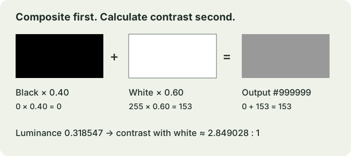
At alpha 0 the output equals the background and the ratio is 1:1. At alpha 1 the calculation becomes the ordinary opaque color-pair check. Fractional output channels are valid intermediate values; retain them until the calculation is finished.
Step 2: calculate luminance and contrast
Divide each composite channel by 255 to get s. Convert it to a linear value using WCAG 2.2’s sRGB definition:
linear(s) = s / 12.92                    if s ≤ 0.04045
            ((s + 0.055) / 1.055)^2.4   otherwise

L = 0.2126 × Rlinear + 0.7152 × Glinear + 0.0722 × Blinear
contrast = (lighter L + 0.05) / (darker L + 0.05)
Repeat the luminance conversion for the opaque background. Luminance runs from 0 for black to 1 for white; contrast runs from 1:1 to 21:1. Keep the calculation’s precision for the decision. A result of 4.499:1 does not meet 4.5:1 just because a short display rounds it to 4.50.
WCAG AA requires at least 4.5:1 for normal text and 3:1 for large text. Large means at least 18 point regular text or 14 point bold text, approximately 24 CSS pixels or 18.7 CSS pixels respectively. “Looks like a heading” is not a size test. This is a color-ratio check, not proof that the font, interaction or whole page is accessible.
Three worked examples, with visible demonstrations
These are constructed examples. Each demonstration sets alpha on the text color and keeps its background opaque. The displayed ratios are rounded; the pass/fail decisions below use the unrounded calculations.
| Text / background / alpha | Composite RGB | Composite L / background L | Ratio | Normal / large |
|---|---|---|---|---|
| Black / white / 0.4 | 153, 153, 153 (#999999) | 0.318547 / 1 | 2.849028:1 | Below / below |
| Black / white / 0.6 | 102, 102, 102 (#666666) | 0.132868 / 1 | 5.741836:1 | Meets / meets |
| White / #123456 / 0.8 | 207.6, 214.4, 221.2 (approximately #D0D6DD) | 0.668790 / 0.032565 | 8.705779:1 | Meets / meets |
1. A faint black label on white
Example label at alpha 0.4
For every channel, 0 × 0.4 + 255 × 0.6 = 153. After conversion, gray’s luminance is 0.318546778. The ratio is 1.05 / (0.318546778 + 0.05), approximately 2.849028. It falls below both text thresholds.
2. Increase the black label’s alpha
Example label at alpha 0.6
Each channel is now 0 × 0.6 + 255 × 0.4 = 102. The lower luminance of 0.132868322 gives approximately 5.741836:1 against white. This pair meets the normal-text AA color-ratio requirement. Raising alpha helped this particular black-on-white pair; check other colors rather than applying a universal opacity percentage.
3. White text over a dark blue card
Example label at alpha 0.8
The background channels are 18, 52 and 86. The red output is 255 × 0.8 + 18 × 0.2 = 207.6; green is 214.4 and blue is 221.2. Calculate from those fractional values, not their rounded hex approximation. The resulting ratio is approximately 8.705779:1. Opaque white against this blue would be about 12.717304:1: a different input gives a different result.
Avoid the checks that answer the wrong question
- Checking the original hex only: an opaque checker cannot infer alpha. Calculate the composite first or use a tool that explicitly supports it.
- Sampling an anti-aliased letter edge: the edge includes partial pixel coverage. For WCAG’s text-color calculation, use the underlying CSS colors, as its Understanding document advises. Use a full-coverage color patch to investigate the compositor, not a fuzzy glyph edge.
- Replacing the background with an average: a photograph or gradient can have bright and dark areas behind the same text. This one-color model cannot certify that situation.
- Assuming a muted label is exempt: placeholder text and text shown on hover or focus still need the relevant contrast check. Read the criterion’s specific exceptions; “secondary information” is not a blanket exception.
- Calling the whole design compliant: links, focus indicators, non-text components and other requirements need their own review. A passing pair is one result.
For small or thin text, consider a pair with room above the minimum and inspect the actual rendering. Meeting a mathematical threshold does not guarantee comfortable reading in every font or viewing condition.
Record the result and choose the next action
Save a check that another person can reproduce:
- Element and state, for example “card helper text, default state.”
- Foreground hex, alpha and actual opaque background hex.
- Composite channels, ratio before display rounding, font size and weight.
- Color-ratio decision and the change made, if needed.
If the ratio is low, increase text alpha, choose a different text color or give the text a suitable opaque surface. Recalculate after each change. Keep hover, focus and other visible states in the same record.
Applying this to a menu? Continue with readable café menu colors. For a page’s surface roles, use the website background color guide. For charts, combine color with labels and line styles rather than making meaning depend on hue alone.
Sources and further reading
- W3C — Compositing and Blending Level 1, simple alpha compositingSections 5.1 and 5.1.1 support the source-over equation; the opaque-backdrop simplification is shown in this guide. The calculator assumes the stated sRGB inputs and ordinary source-over context.
- W3C — WCAG 2.2, relative luminance definitionDefines sRGB conversion, channel weights and relative luminance. The three arithmetic examples are original calculations.
- W3C — Understanding Success Criterion 1.4.3: Contrast (Minimum)Supports AA thresholds, large-text size, no rounding at the threshold, CSS-color checking rather than anti-aliased edges, and the treatment of placeholders and visible states. Sources checked 5 November 2026.