Practical guide
Highlight One Chart Series Without Hiding the Comparison
Keep any reference needed for the comparison visible. An exact four-period example separates visual emphasis, line identification and background contrast.
On this page
Highlighting should preserve the question’s evidence
If readers need the reference series to answer the question, keep it readable. A pale gray line can communicate visual hierarchy while becoming too faint to follow on the chart surface. Calling it “context” does not automatically make it decorative.
For this original chart the question is: “Was Focus above Reference in P4, and how did that comparison change across four periods?” The reference values are part of the answer. A design that preserves only the highlighted line loses essential comparison information.
De-emphasis can use a different stroke style, direct name and careful weight instead of extreme fading. Decide which series are actually needed, then check their actual adjacent surfaces. The source distinguishes required graphical objects from aesthetic information and notes when visible equivalent labels and values supply the meaning.
Basis: [2]
Inspect the complete four-period comparison
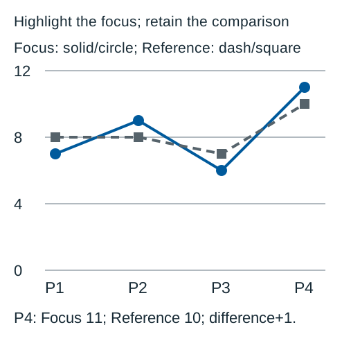
Download the original labelled SVG
On a narrow screen, scroll inside the table. The region can receive keyboard focus.
| Period | Focus | Reference | Focus minus Reference |
|---|---|---|---|
| P1 | 7 | 8 | -1 |
| P2 | 9 | 8 | 1 |
| P3 | 6 | 7 | -1 |
| P4 | 11 | 10 | 1 |
Download the complete comparison CSV
Focus finishes at 11 and Reference at 10, so the P4 difference is +1 fictional unit. Focus is below in P1, above in P2, below in P3 and above in P4. The focus line itself is not a continuously increasing trend. Color emphasis must not change that reading.
Check the reference color against its real surface
On a narrow screen, scroll inside the table. The region can receive keyboard focus.
| Role | Color | Background | Calculated ratio |
|---|---|---|---|
| Focus | #005A9C | #FFFFFF | 7.136726: 1 |
| Too-pale reference candidate | #CBD5E1 | #FFFFFF | 1.484702: 1 |
| Visible reference candidate | #56636B | #FFFFFF | 6.189705: 1 |
The pale candidate is below 3: 1 against white. If its line is required to understand the comparison, that nominal pair is insufficient. The selected darker gray exceeds 3: 1 against white. Its gray hue is not what determines the numerical contrast result.
A dashed line and square markers add visible identification, but a dash drawn in an unreadably pale color can still disappear. Keep both identification and visibility in the review. Conversely, a dark enough line without a visible name can still leave a reader unsure which series it means.
The exact table communicates the comparison in ordinary text, while the graphic supports scanning. Text has its own contrast check. These nominal sRGB ratios do not establish that every physical screen, export or chart interaction is fully accessible.
Basis: [3]
Keep the highlighting rule explicit and stable
Give the focus series a named role. In this example Focus uses a solid blue line and circles, while Reference uses dark gray dashes and squares. The same assignments apply in all periods. “Follow the bright line” is weaker than a name and a consistent visible cue.
For many contextual series, first ask whether all of them are needed. A separate panel, range summary with a documented definition, or smaller comparison set may answer the question more clearly. Do not silently aggregate a set into a single reference line without explaining its calculation.
A selected series in an interactive chart needs a visible selection indicator and an understandable legend. Default context must still be discernible if it is the route to selecting a series. Hover-only restoration of contrast does not help someone who cannot initially locate the line, and hover behavior disappears in a static export.
Review the actual line and exported comparison
Inspect the smallest intended rendering: do dashes remain distinct, do square markers survive, and are line names and values readable? Overlap at a crossing does not mean every pair of series must achieve 3: 1 against each other. The actual required parts, adjacency and ability to follow the line determine the check.
Basis: [2]
Retain the complete values and units with an exported chart. If the image loses its legend, the written comparison should still identify Focus and Reference. If a user can hide Reference, update the title or explanation so it does not promise a comparison that is no longer displayed.
Recheck the palette when the chart surface changes. A gray that works on white may fail on a dark panel, and a dark focus line can also disappear there. Review the dark-chart pair matrix for that separate surface-change task.
Try three focus and reference decisions
Use the exact P1–P4 dataset and opaque white background.
Case 1
Is the Reference line decorative because the design makes it gray?
Show answer and explanation for case 1
No, when the stated question requires its comparison values.
Its role in answering the question matters. Gray styling does not remove the need to distinguish it, or the alternative information requirements.
Case 2
Does a dash pattern repair a reference line whose nominal contrast is below 3: 1 when the line is required?
Show answer and explanation for case 2
Not by itself.
The same too-pale strokes can remain hard to see. Use a sufficiently contrasting actual pair as well as a visible identification cue.
Case 3
Does the highlighted Focus line exceed Reference at all four periods?
Show answer and explanation for case 3
No. It is below at P1 and P3.
The exact differences are -1,+1,-1,+1. Visual emphasis identifies a series; it does not make all of its comparisons positive.
Sources and further reading
- W3C: Understanding Use of Color, SC 1.4.1Visible alternatives to color-assigned meaning, including the distinction between visible cues and information supplied only to assistive technology.
- W3C: Understanding Non-text Contrast, SC 1.4.11Required graphical information, actual adjacent pairs, chart-edge examples and equivalent visible labels and values.
- W3C: Understanding Contrast (Minimum), SC 1.4.3Ordinary-text 4.5: 1 and qualifying-large-text 3: 1 thresholds, unrounded comparisons and sRGB luminance/contrast definitions.