Practical guide
Dark Chart Colors: Recheck Lines, Labels and Adjacent Surfaces
Recalculate the actual chart pairs when the surface changes. Complete light/dark role samples separate series visibility, ordinary text and fixed SVG export backgrounds.
On this page
A theme change creates new adjacent pairs
Recheck every foreground against the surface it actually uses. Switching a chart from white to dark does not preserve its previous line or text contrast. A dark blue that was visible on white can blend into a dark plot area.
Start with a role inventory: plot background, series strokes, markers, axis and grid information, labels, any labels inside colored fills, and interactive focus or selection cues. Each role can have a different adjacent surface. Replacing only a page background does not necessarily recolor the SVG or its exported image.
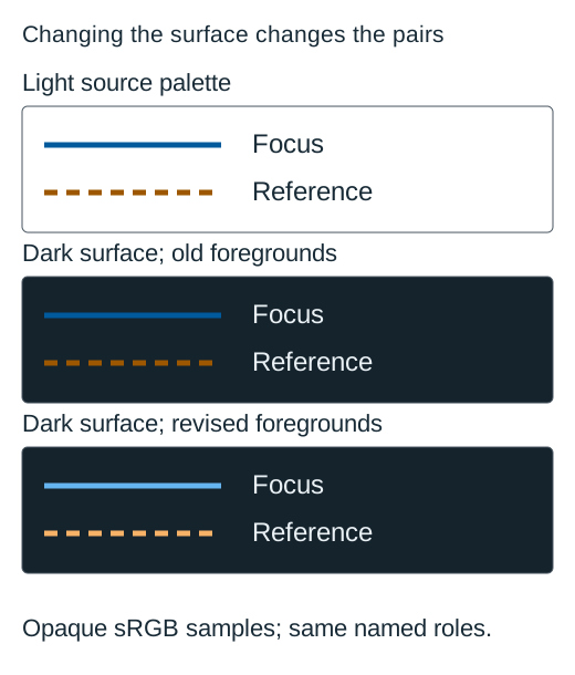
This article uses original opaque sRGB role samples and exact calculated pairs. The names Focus and Reference stay the same across themes. No user preference study, physical screen measurement or complete chart-product conformance is claimed.
Inspect the same roles on light and dark surfaces
Download the original labelled SVG
On a narrow screen, scroll inside the table. The region can receive keyboard focus.
| Role | Foreground | Background | Calculated ratio |
|---|---|---|---|
| Light chart focus | #005A9C | #FFFFFF | 7.136726: 1 |
| Same focus on dark | #005A9C | #15232D | 2.245876: 1 |
| Dark chart focus | #66B4F0 | #15232D | 7.137672: 1 |
| Light reference | #9C5700 | #FFFFFF | 5.560171: 1 |
| Same reference on dark | #9C5700 | #15232D | 2.882681: 1 |
| Dark chart reference | #F7B267 | #15232D | 8.791729: 1 |
| Dark text on white | #182B36 | #FFFFFF | 14.607099: 1 |
| Same text on dark | #182B36 | #15232D | 1.097288: 1 |
| Light text on dark | #EAF1F5 | #15232D | 14.043082: 1 |
Download the original exact pair calculations
The original blue and orange each exceed 4.5: 1 against white. On the declared dark surface, both are below 3: 1. The proposed brighter dark-theme alternatives each exceed 4.5: 1 against that dark surface. The same hex token gives a different pair because the background changed.
The sample labels stay outside the series strokes. In the middle panel, labels use light text so the role names remain visible even while the unchanged series colors illustrate the contrast problem.
Distinguish line, text and important grid information
For graphical parts required to understand a chart, evaluate the actual relevant adjacency under the 3: 1 non-text criterion. Text generally needs 4.5: 1 unless it qualifies for the large-text threshold or another defined exception. A line color can meet 3: 1 and still be unsuitable for ordinary text.
A grid can be decorative when exact values and scale information remain available by another effective route. If reading a value requires seeing its graduated guide lines, those lines contribute required information instead. Decide from the chart’s actual question and information alternatives, rather than calling every grid decorative.
Basis: [2]
Labels inside series fills need fill-specific calculations. The brighter blue used as a line on dark does not automatically support white text written on that blue. Inverting a label blindly can fail even when the series/background check improves. Keep the actual foreground and immediate background together in the audit.
Change the color role while preserving category meaning
A dark theme may need a brighter token for the same category. Record light and dark values under the same stable identity. A category should not acquire the former color of another series merely because a theme switches palettes or sorts a legend.
Retain visible names and second cues. Focus is a solid line and Reference dashed in these role samples. If the actual chart depends on circles and squares, preserve those assignments too. Hue recognition alone should not carry the distinction.
Basis: [1]
Avoid describing a color as universally safe or accessible. Its effectiveness depends on its actual pair and the required task. A dark sample may have strong nominal contrast but still contain tiny labels, overlapping marks or missing values that need separate treatment.
Check the SVG’s own background and static output
An SVG with an explicit white rectangle remains white even when the surrounding page becomes dark, unless the implementation changes that rectangle. An SVG with a transparent background may instead inherit the visible surface behind it. These are different rendering conditions.
The original SVG here deliberately draws all three fixed panels, including their backgrounds. Its role is to compare pairs, not to automatically adapt to your browser theme. The downloadable file preserves those stated surfaces. An exported chart needs the same explicit background/foreground intent.
For a real chart, inspect light and dark states, labels on fills, focus states where applicable, and exported images. Keep source data and named roles stable. If the export renderer does not apply the application theme, specify an export theme rather than assuming the output matches the screen.
Paper reproduction needs a separate color-managed review. A dark digital chart may consume ink or lose distinctions under a printer process. These sRGB calculations do not measure that result.
Try three theme-change decisions
Use the exact opaque foregrounds and surfaces in the matrix.
Case 1
Does #005A9C retain its white-background ratio when the surface becomes #15232D?
Show answer and explanation for case 1
No. The actual pair changes.
It passes the stated white-background check but is below 3: 1 against the declared dark background. Recalculate rather than copying its former result.
Case 2
Does a line passing 3: 1 automatically qualify as ordinary-text color?
Show answer and explanation for case 2
No. Ordinary text uses 4.5: 1.
Evaluate text against its immediate surface separately. A series stroke result cannot certify an inside-fill label pair.
Case 3
Will changing the page background alone change a fixed white rectangle inside an SVG?
Show answer and explanation for case 3
No. That rectangle has its own fill.
Inspect and configure the graphic itself or its export. A surrounding theme does not prove that the chart’s actual internal surfaces changed.
Sources and further reading
- W3C: Understanding Use of Color, SC 1.4.1Visible alternatives to color-assigned meaning, including the distinction between visible cues and information supplied only to assistive technology.
- W3C: Understanding Non-text Contrast, SC 1.4.11Required graphical information, actual adjacent pairs, chart-edge examples and equivalent visible labels and values.
- W3C: Understanding Contrast (Minimum), SC 1.4.3Ordinary-text 4.5: 1 and qualifying-large-text 3: 1 thresholds, unrounded comparisons and sRGB luminance/contrast definitions.